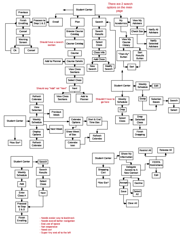
This showcases the process flow of MyKU as it currently is, including all errors. Also included is the competitor analysis. Which includes companys websites that I think have a good user exprience.
Main issue that consistently bugs me with MyKU is the back button, it is very glitchy and
irritating. Also ran into breaking pages, and just an overwhelming amount of content.
Whether that be duplicate options, unclear instructions, mis-wording, etc.
Competitive Anaylisis
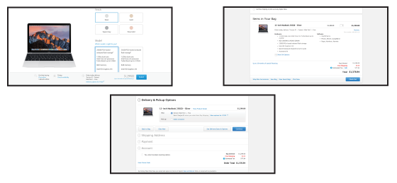
APPLE https://www.apple.com/
I feel Apples checkout is simple, elegant, and to the point. This definitely coincides with
Apples aesthetic. They make it very obvious when you select something with there
bright blue colors against there bright white background. The buttons have a nice
dimension and a good click response when used to help you see the action. They
do a good job on not overloading with information.
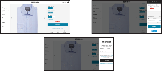
BONOBOS https://bonobos.com/
I like how Bonobos’ checkout keeps you on the main page. It’s unique and different. It easily
allows you to go back to shopping and then quick view your cart and complete the purchase
from there. They don’t overload you with information and provide only the necessary fields
and information. The response time when using the buttons is very speedy.
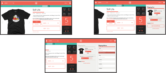
COTTON BUREAU https://cottonbureau.com/shop/
Cotton Bureau utilizes the side bar check out very well. As you move on through the
checkout process, the page shifts, which allows for a unique checkout experience and even
allows you to continue the purchase through this sidebar. It is a quick and affective online
shopping experience.
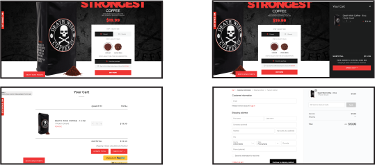
DEATH WISH COFFEE https://www.deathwishcoffee.com/
Death Wish Coffee has a typical shopping cart layout but it works. It is sleek, simple, and
easy to understand. It takes you to different pages and limits the amount of reading on each
page. The response time on buttons and other interactive areas is very well done. It also
utilizes the sidebar shopping cart while shopping which I think is really useful to keep track
of all you have in your cart already.
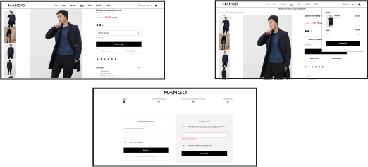
MANGO https://shop.mango.com/
Mango has a typical clothing store online checkout however it still works great. It has a
quick view cart which comes in handy when shopping and keeping track of whats in your
cart already as well as an idea of how much you are spending. Then when you go to the
checkout process you get a nice sleek interface to deal with that has a great response time.
It also provides you at the top with what number step you are on of the purchase process.