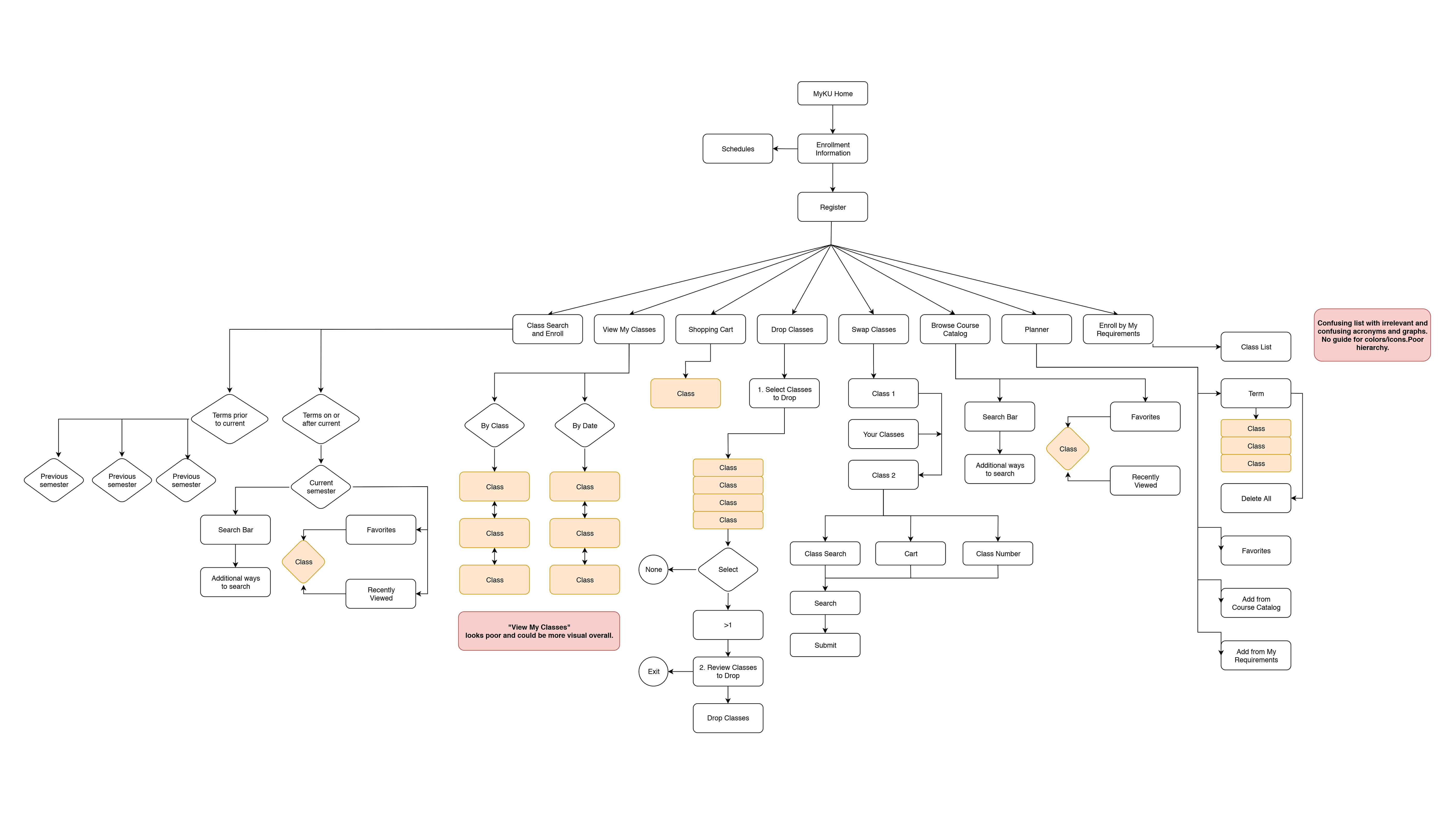
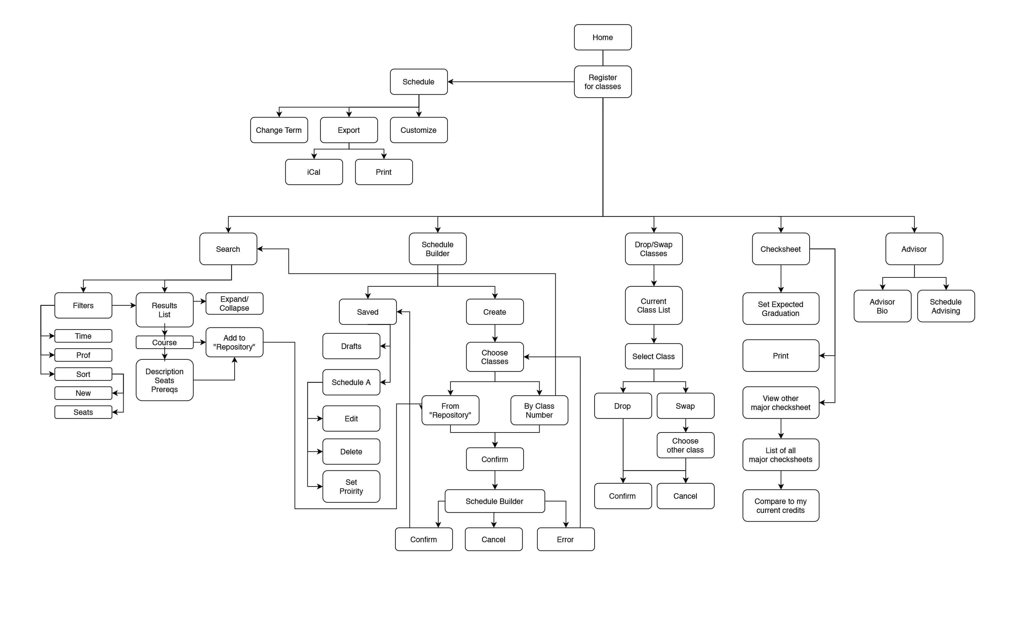
The first step in the process was to analyze the MyKU registration site and create a process flow of the showing all the steps, options and pages. The pain points I found along the way are written in red.
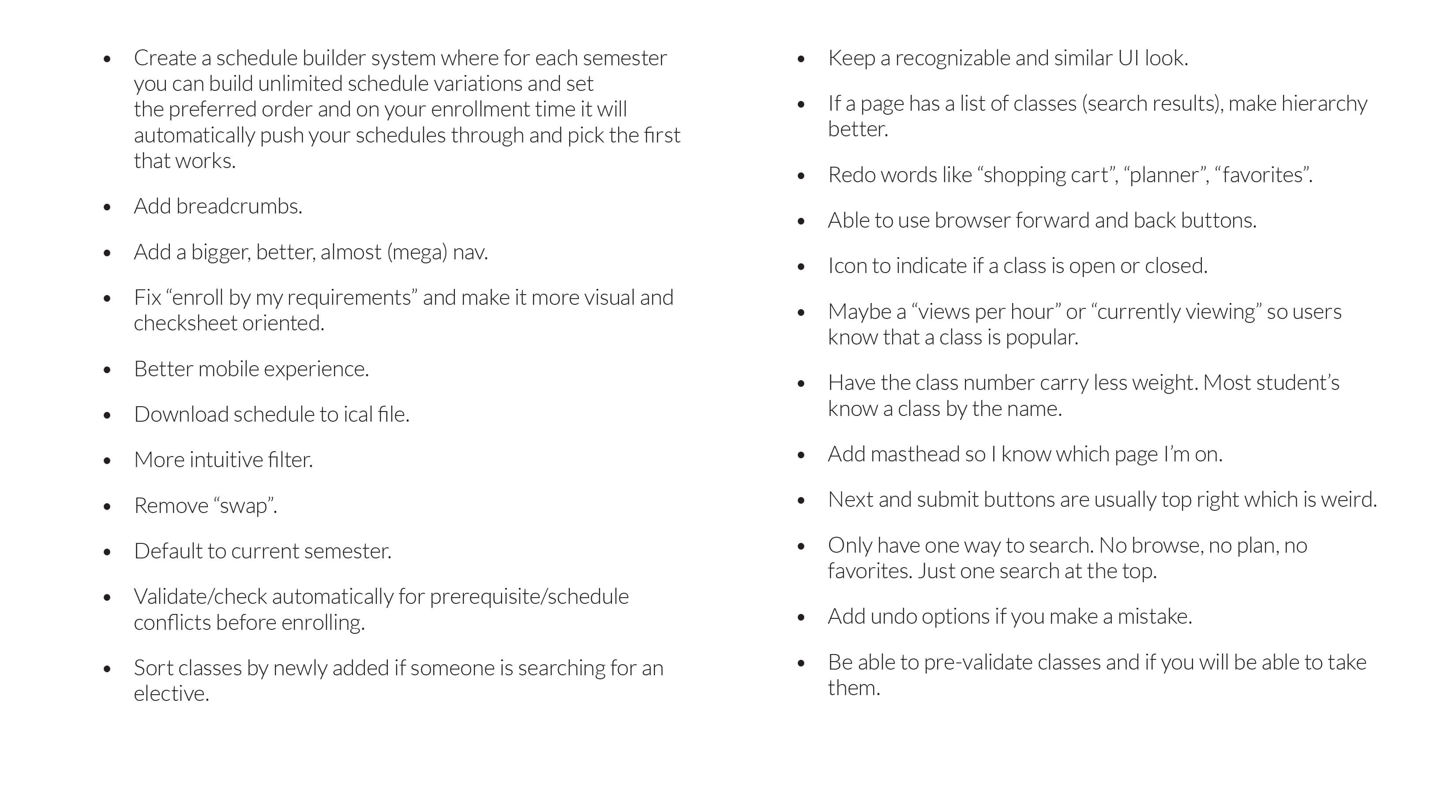
Next a feature list was created. I included things that seemed confusing, unnecessary, redundant. I also included my “wants”, or features someone would look for in a site like this.
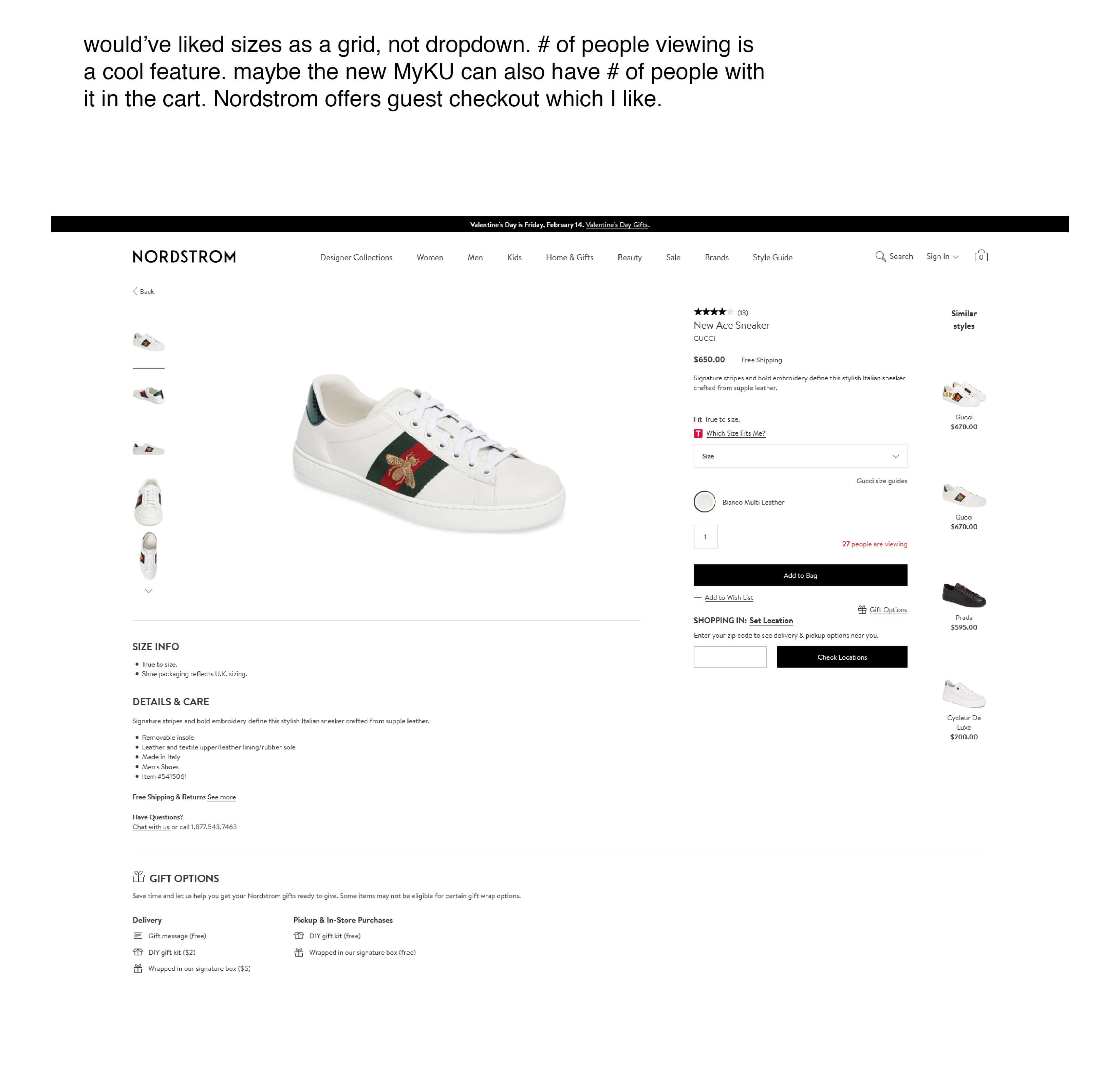
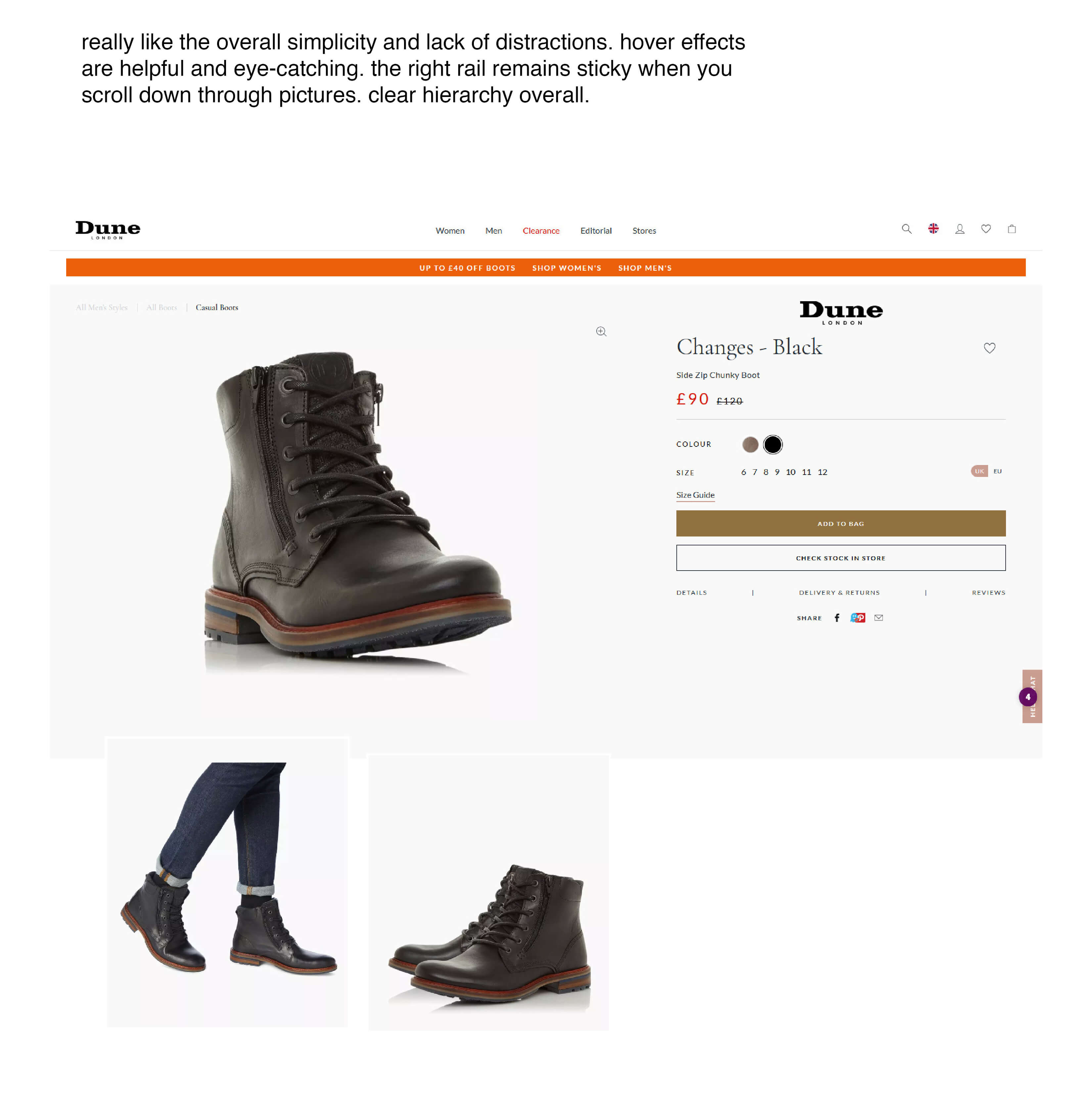
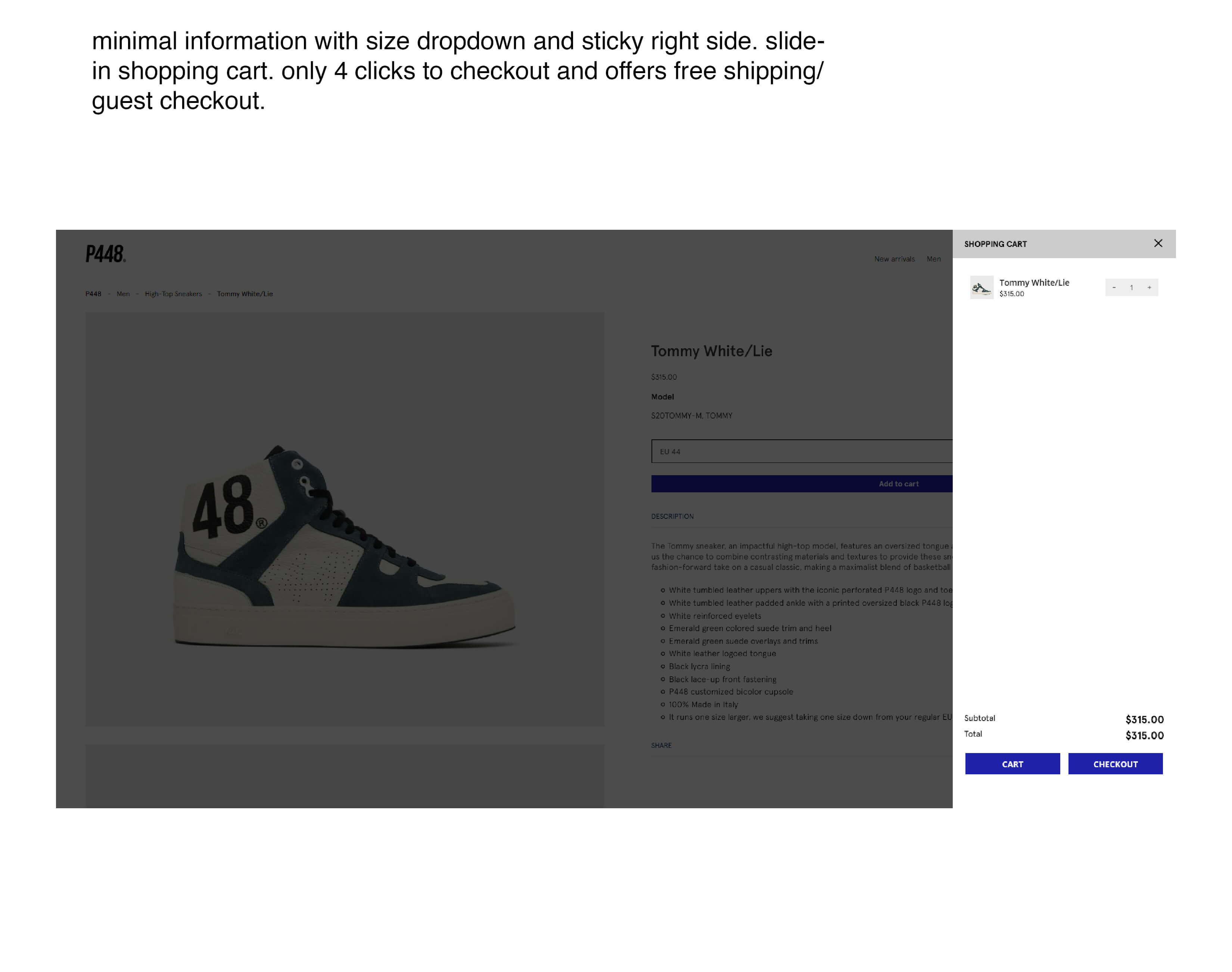
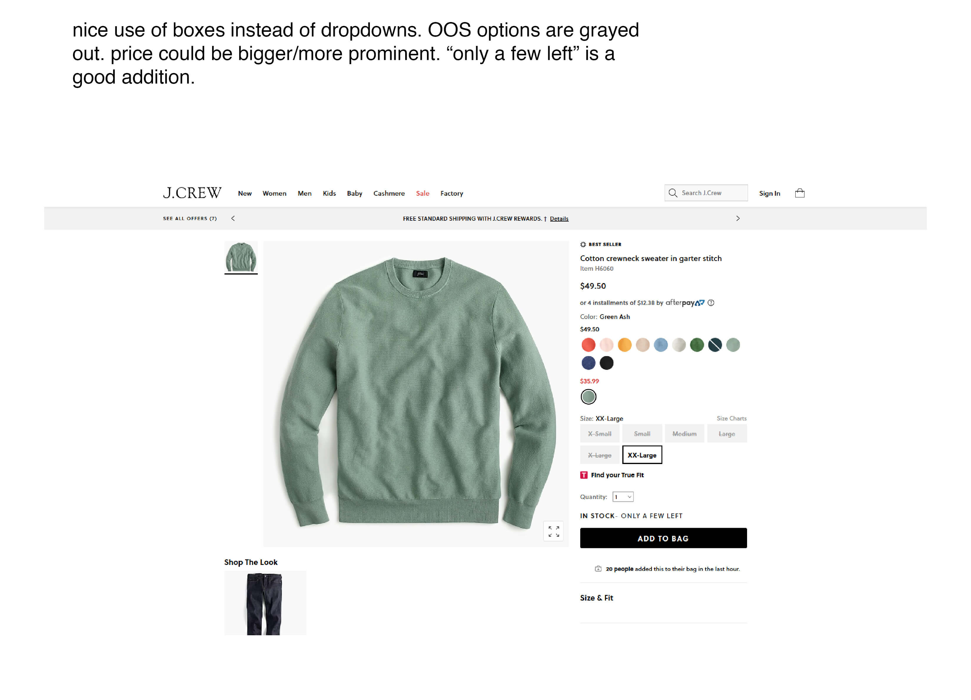
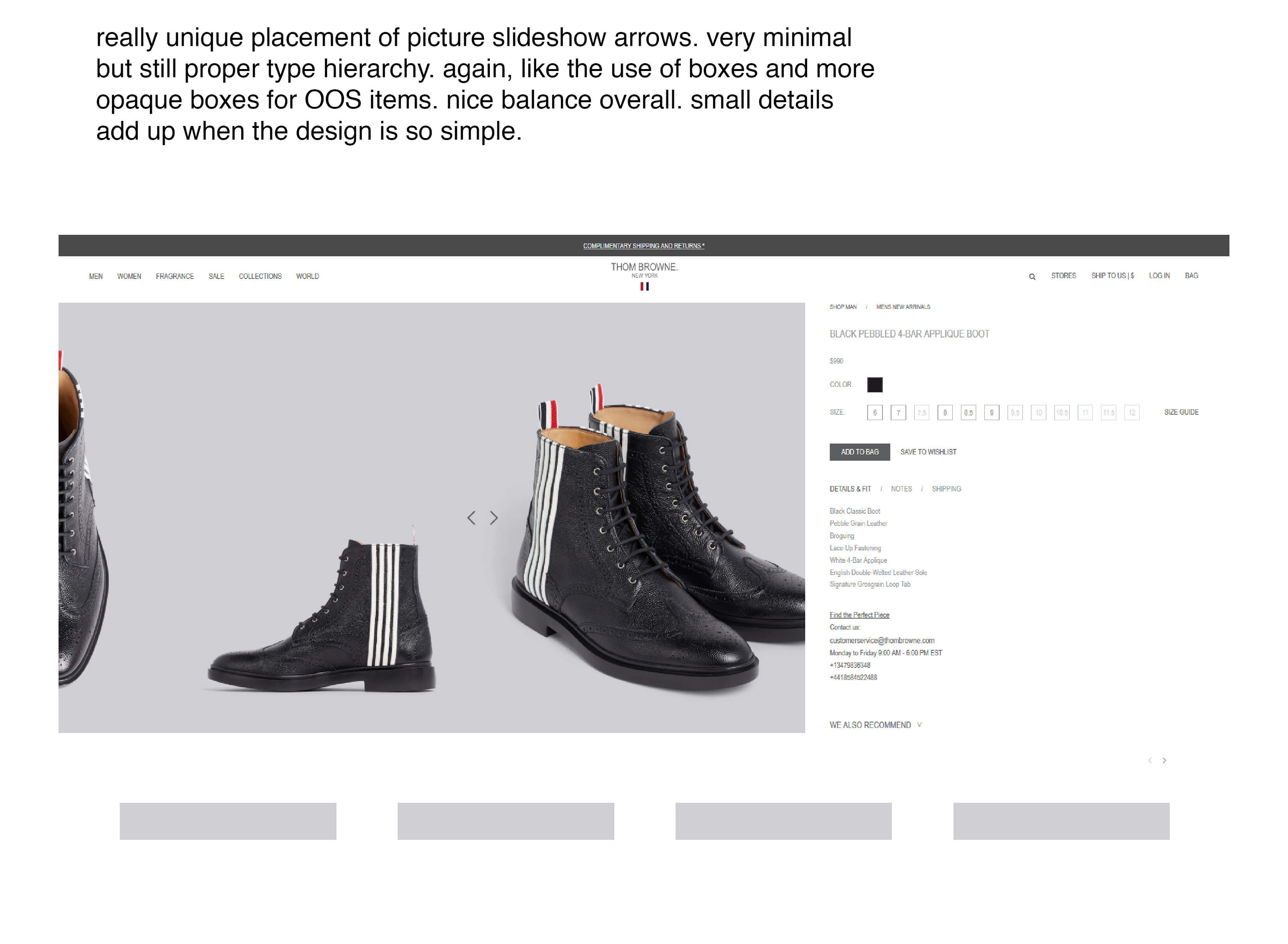
I explored websites with good UX and UI design, making notes of what was working and what was not. This analysis would then be considered in the design process.
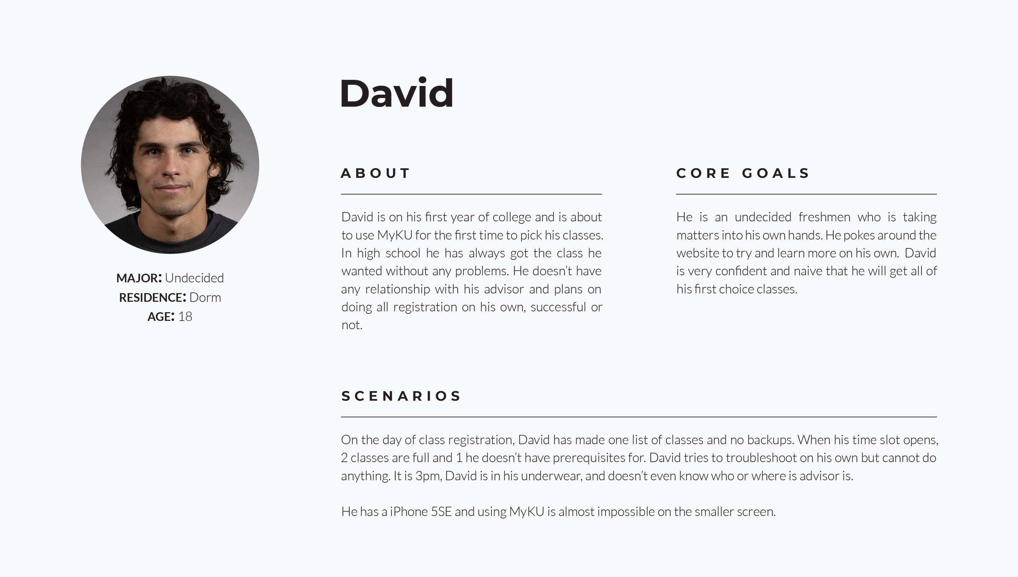
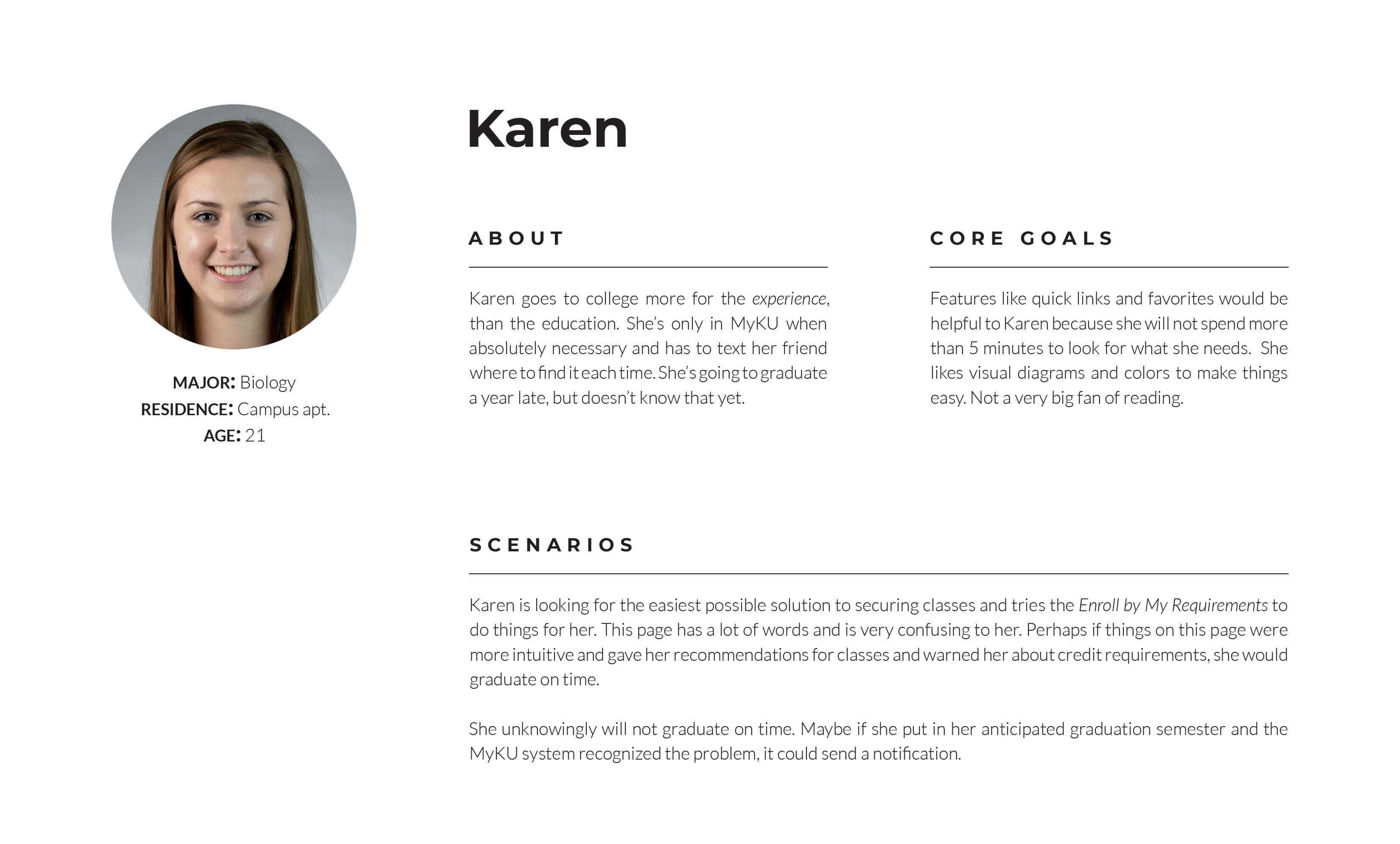
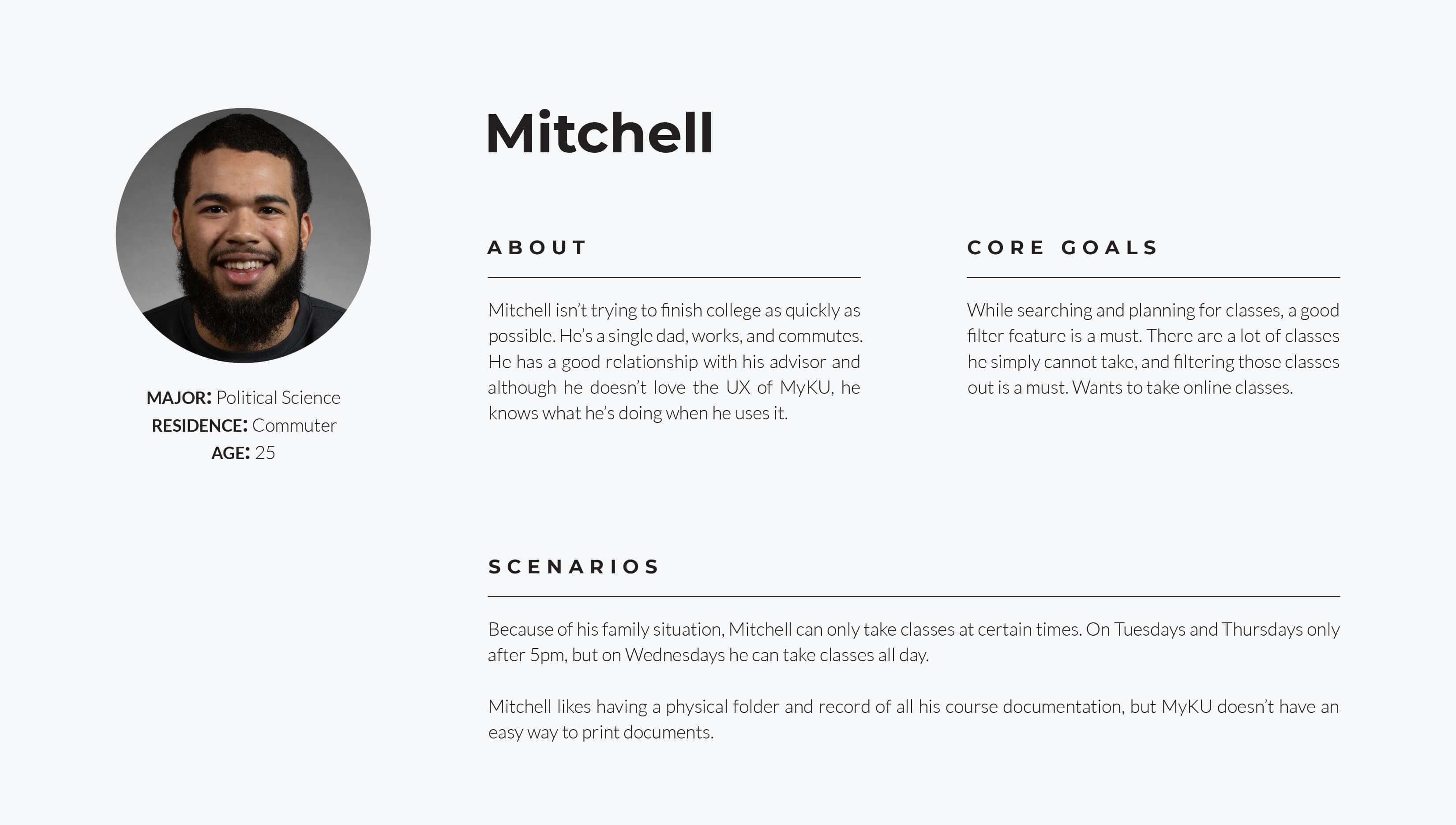
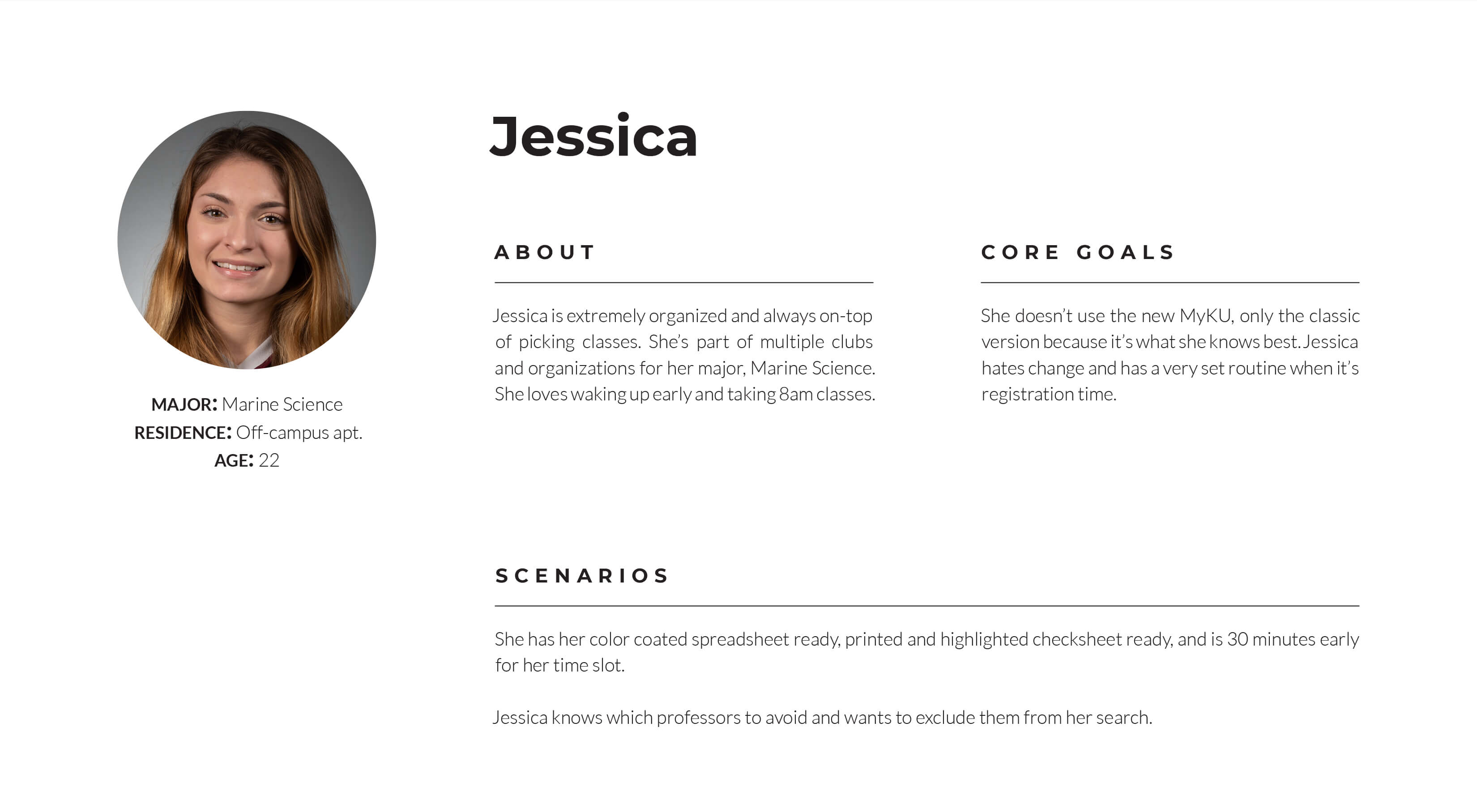
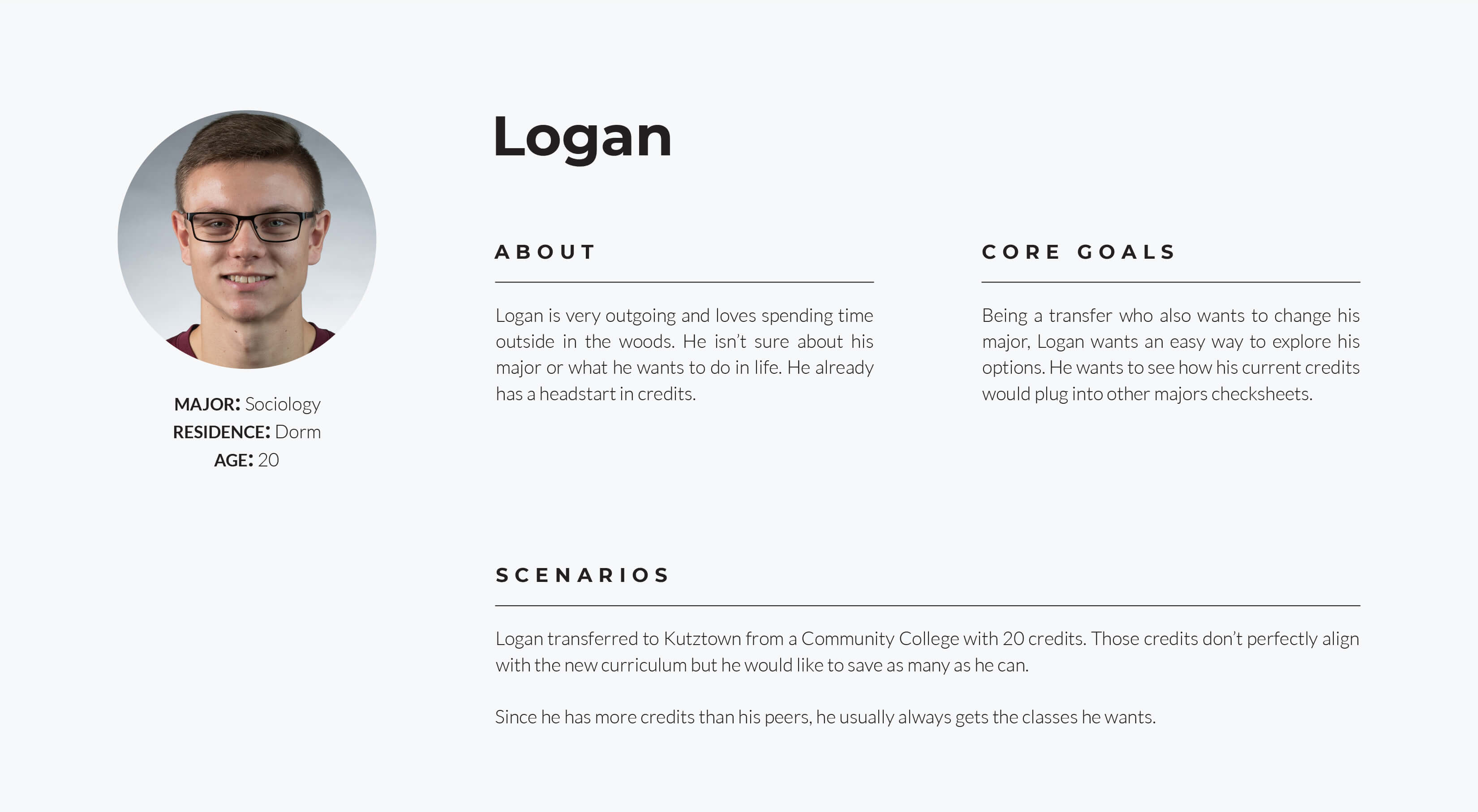
Different personas were made up for the kinds of people that would use MyKU. Variables like residence, age, technology were all considered. Each persona also has 2 scenarios that should easily be possible when redesigning the new site.
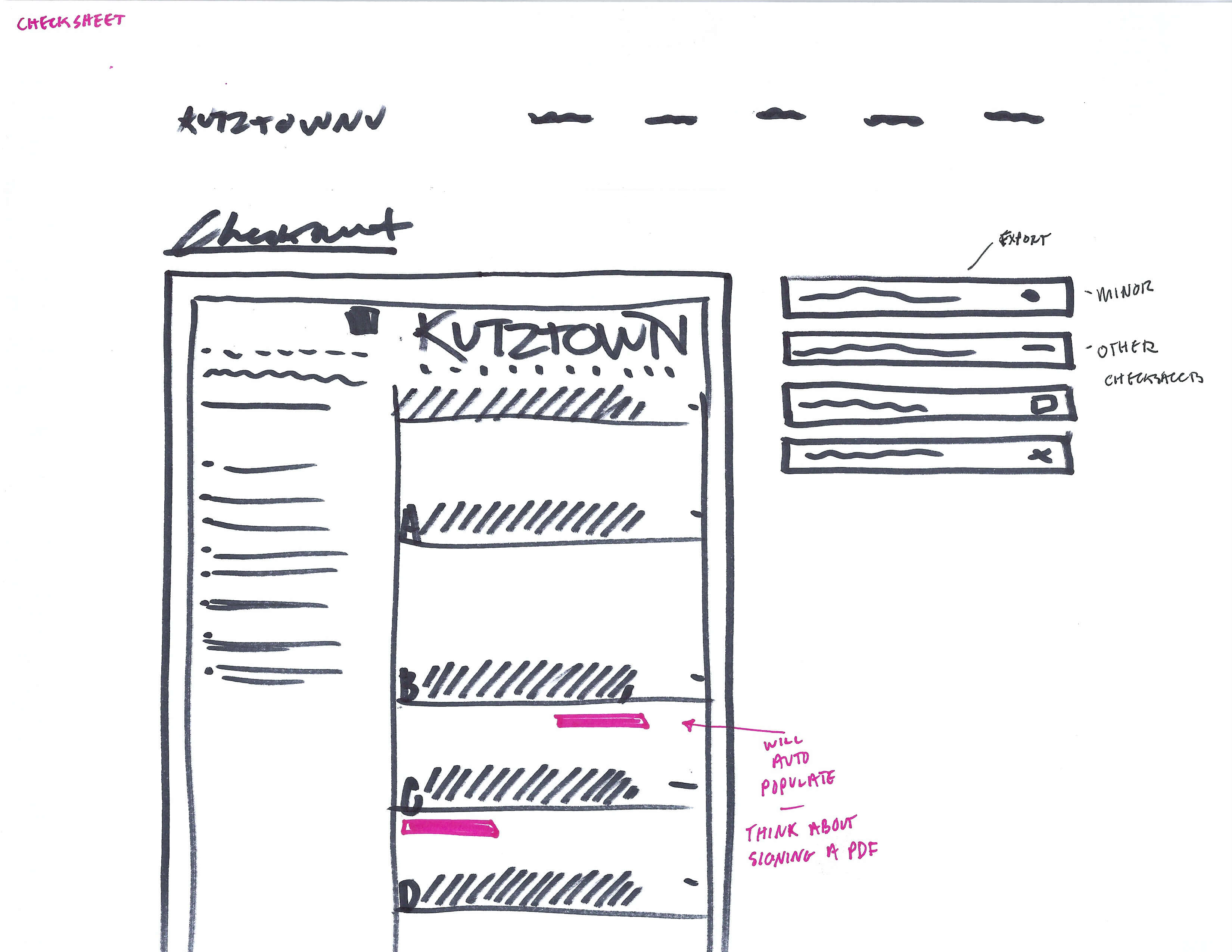
After my research I went back to a flowchart and reordered pages and menus in a way that would make sense. I grouped things differently, condensed pages, and added more useful features. This is what I will reference when making my wireframes.
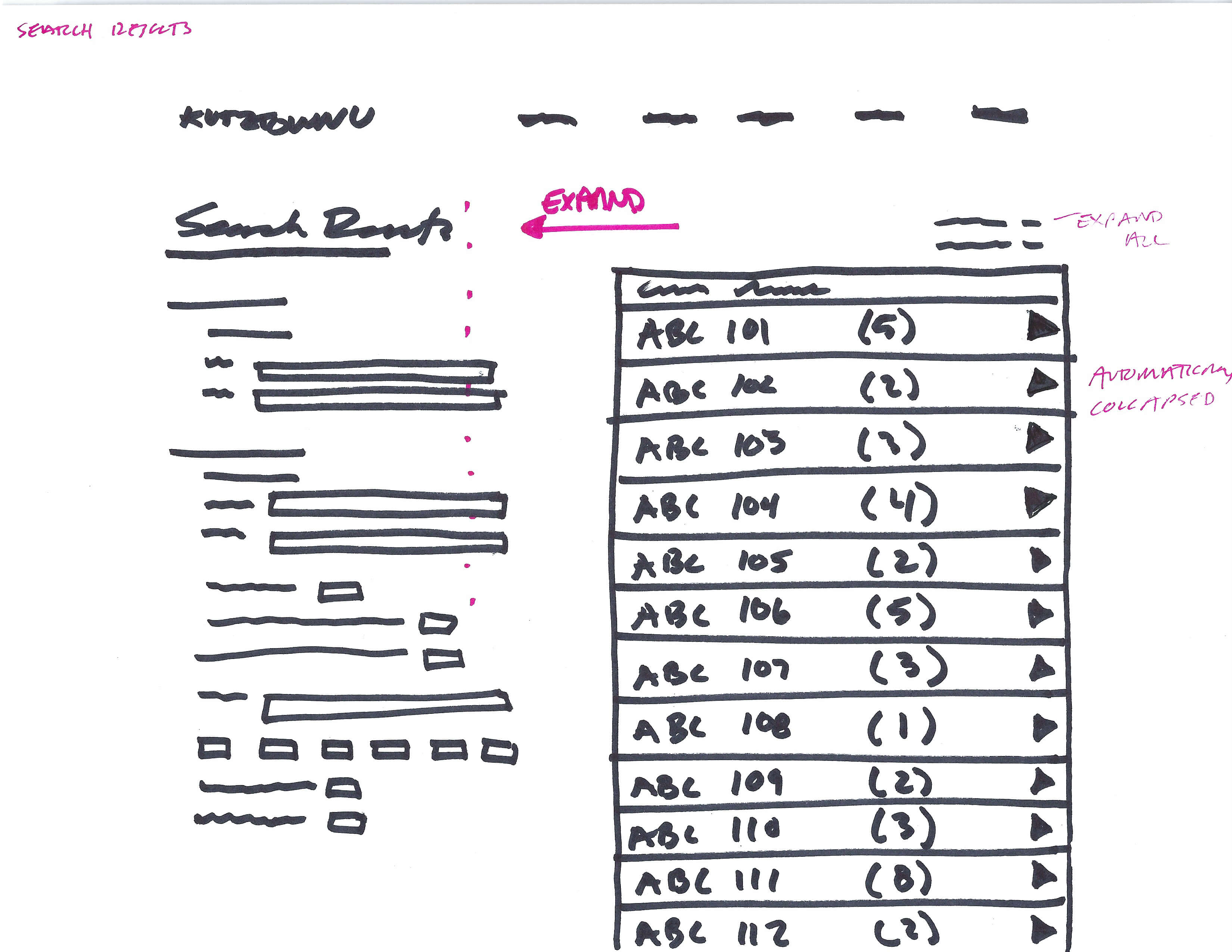
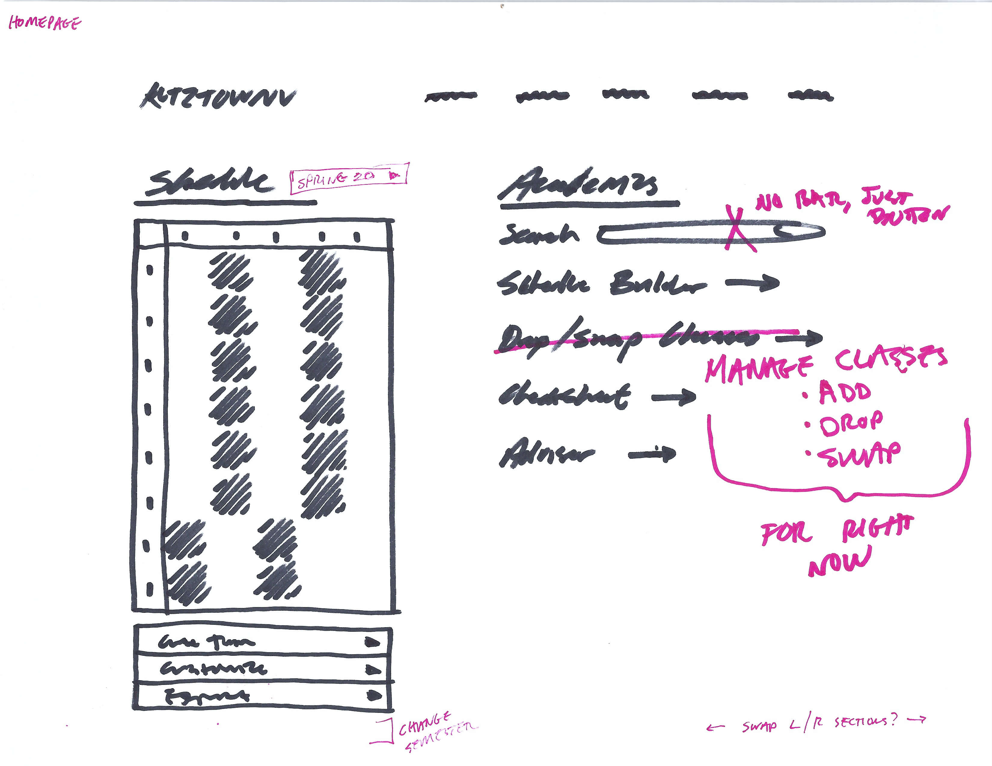
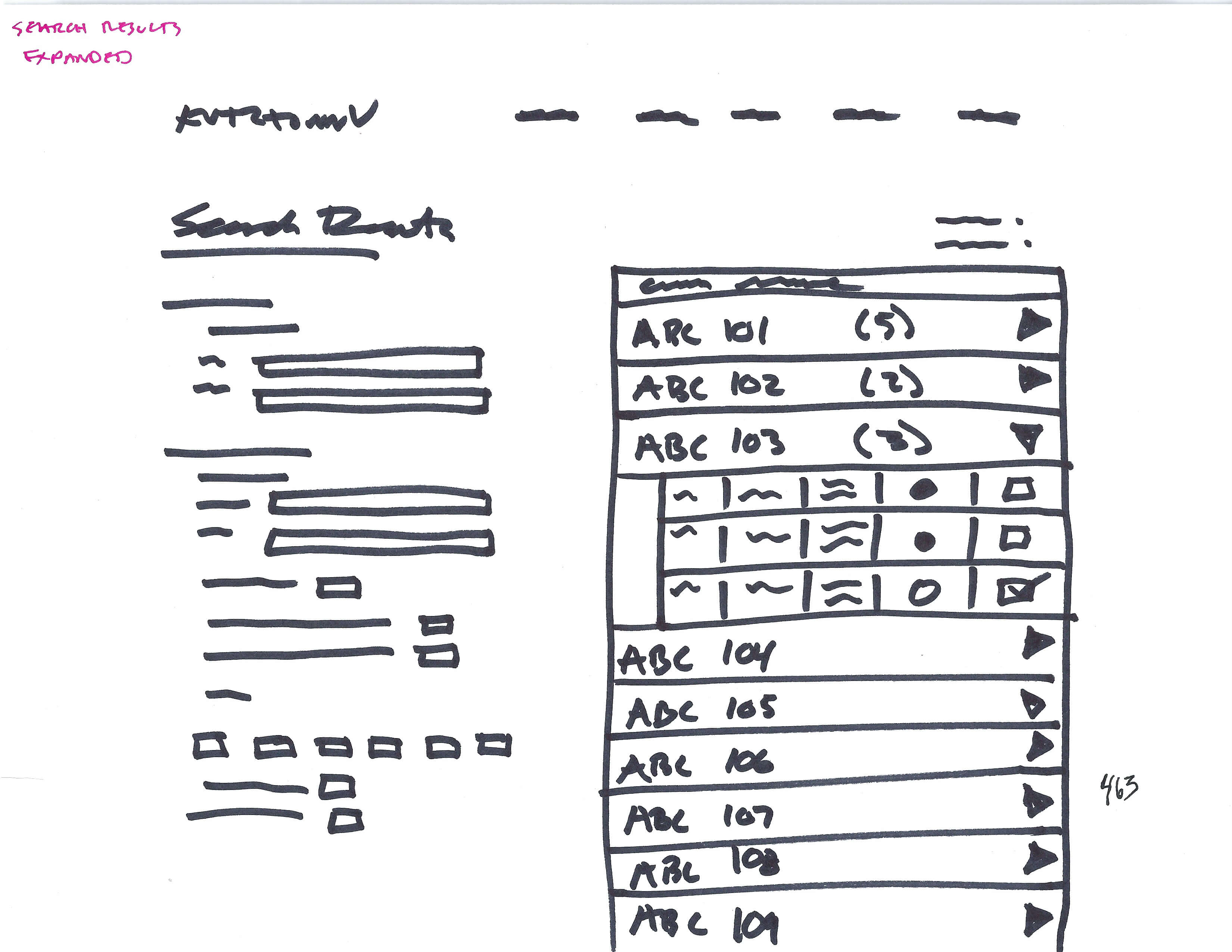
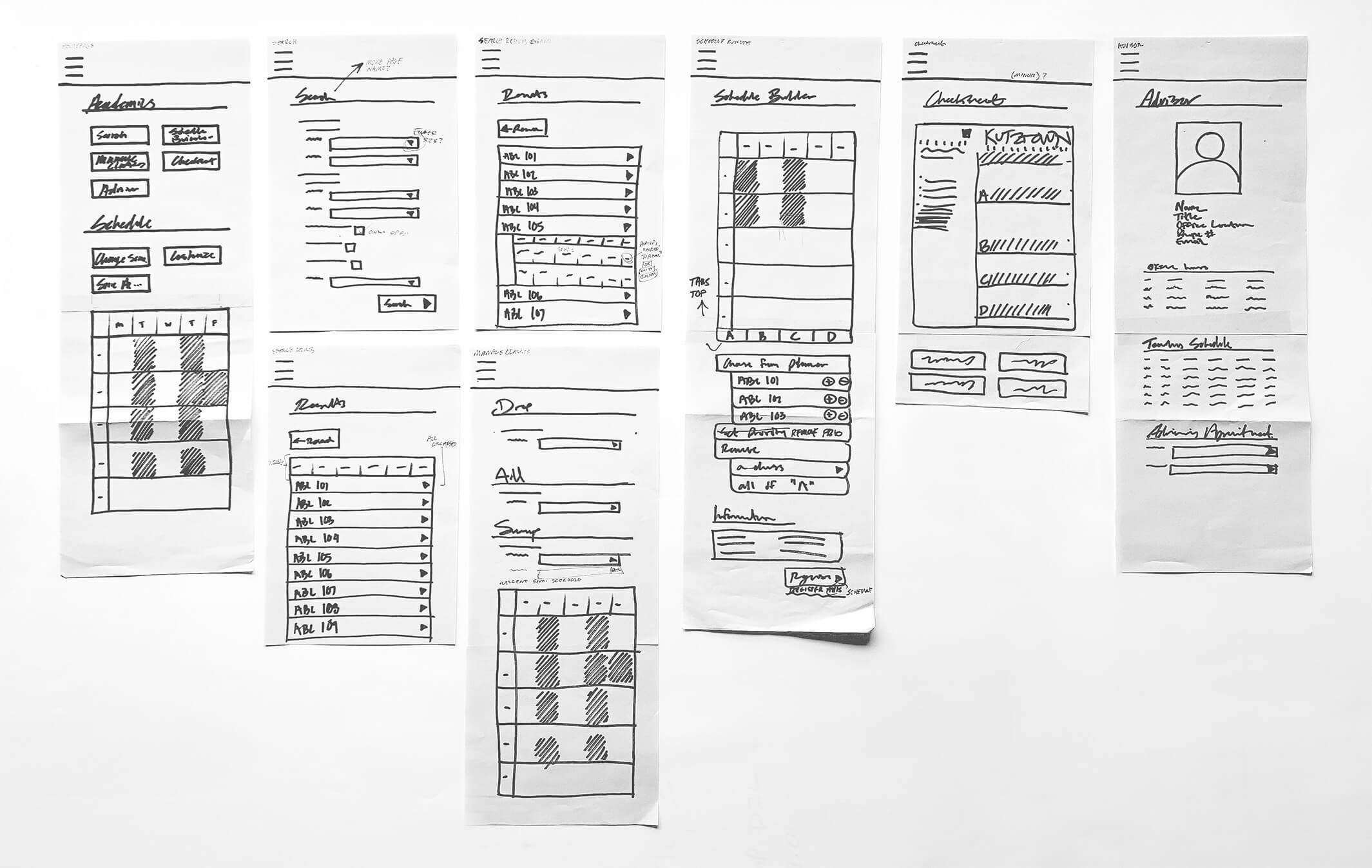
After finalizing the new process flow, I moved to pen and paper to visualize the layout of nav bars, column systems, and visual hierarchy. These were reworked multiple times, each time tested and compared with other classmates. It was important for these wireframes to pass every scenario a user would want to do.


The paper desktop wireframes were then translated to a mobile size. Keeping in mind menus, finger size, scrollability.
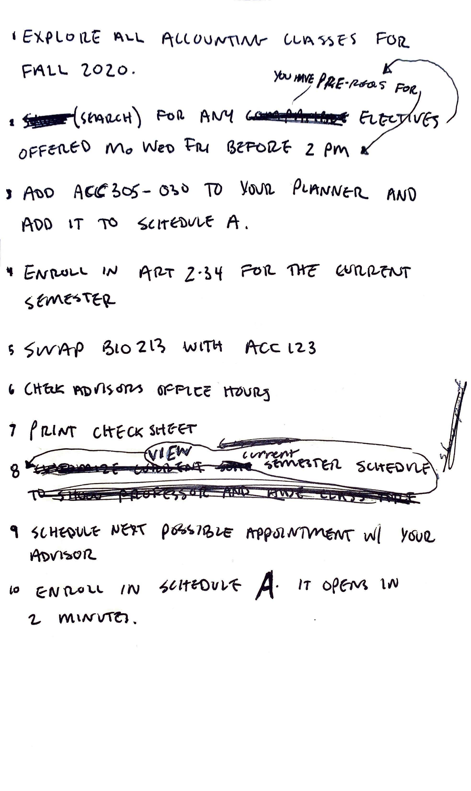
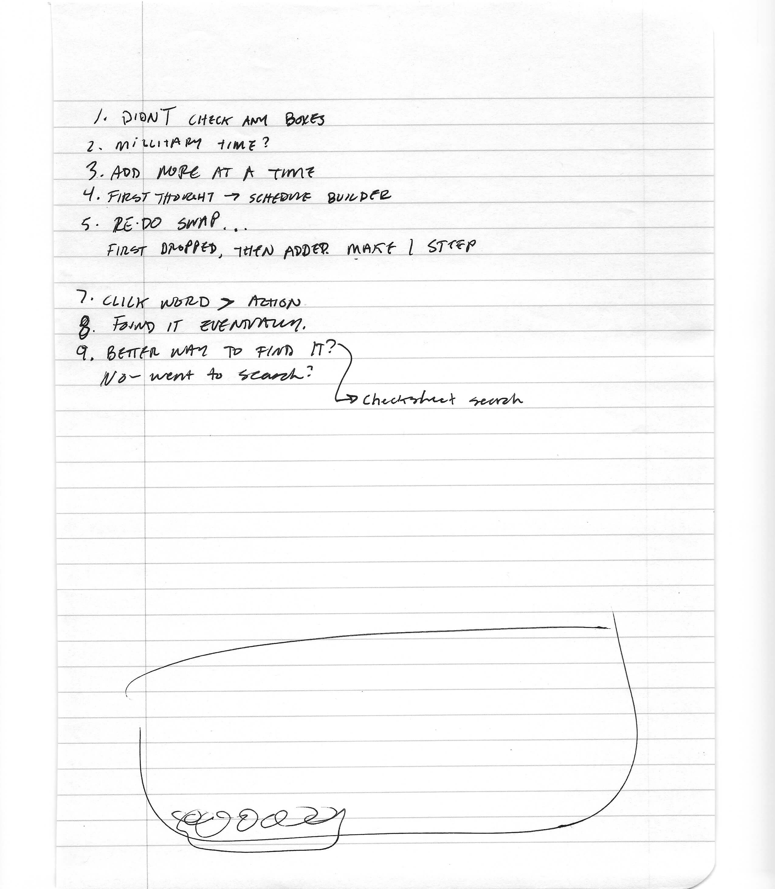
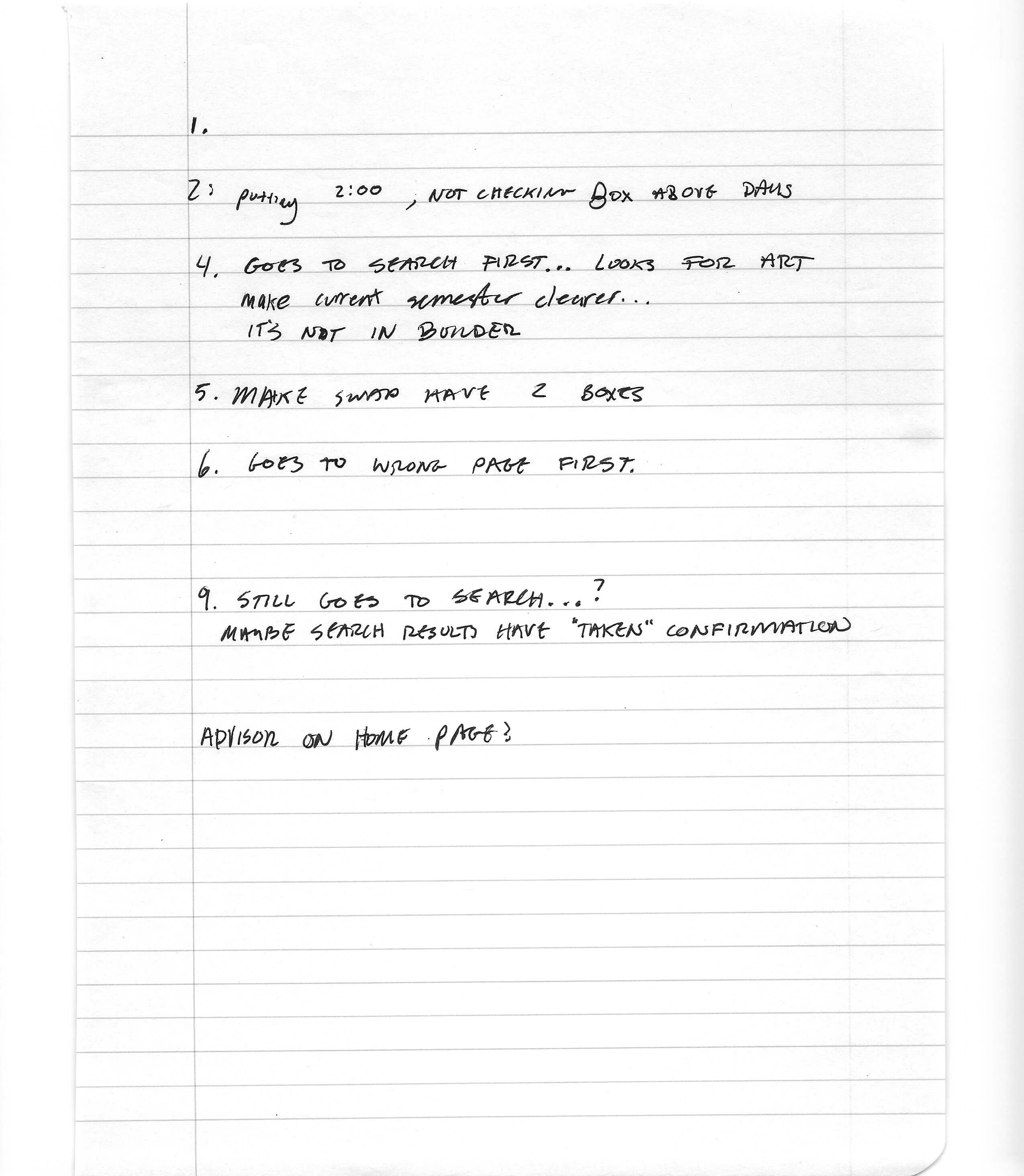
I wrote out a script of 10 scenarios I would ask a user when performing user testing. These questions were designed to cover each part of the site and assure that pages and items were easy to find, minimizing thinking for the user and wasted clicks.
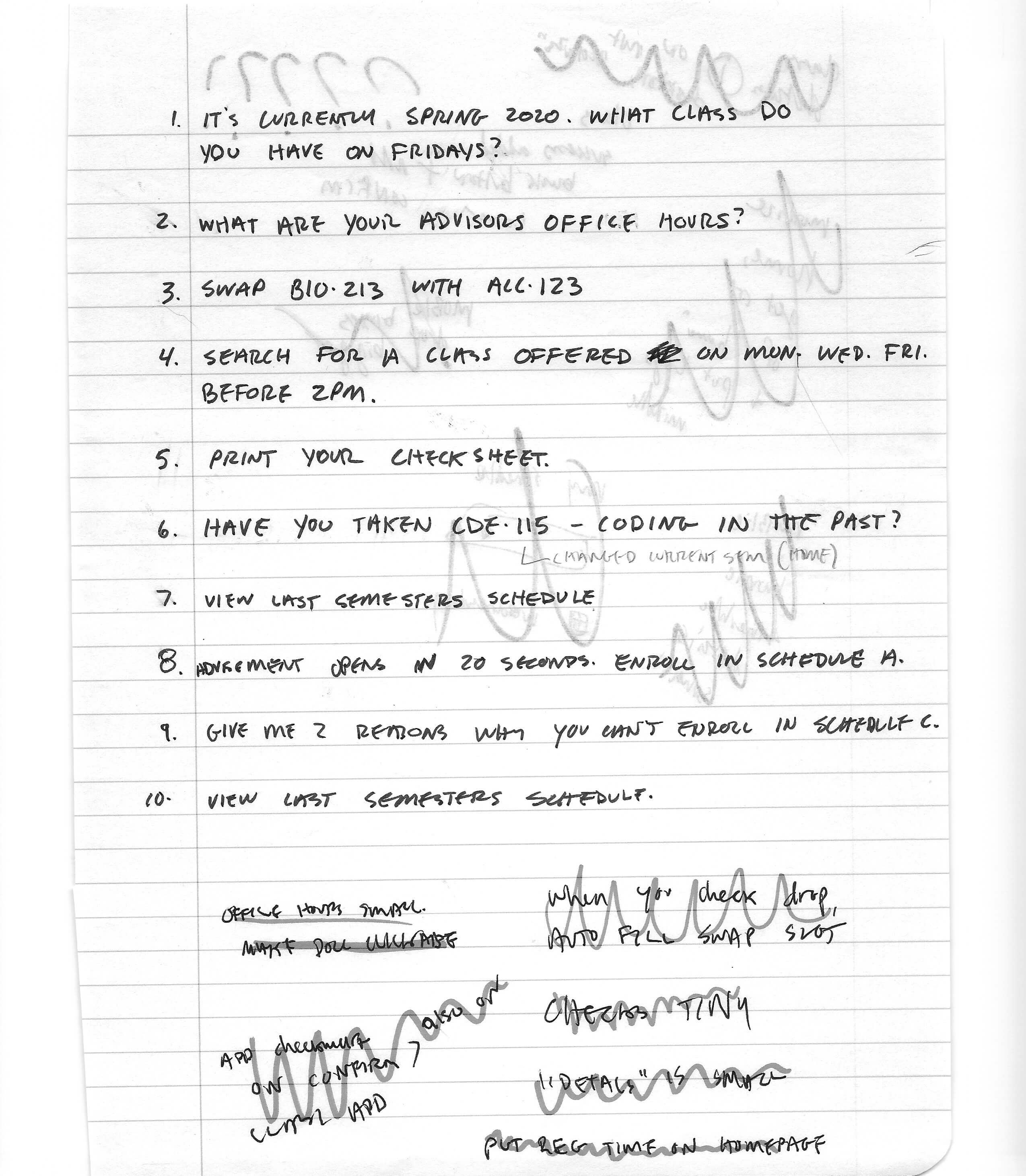
I then went through three sets of user testing, asking them revised questions from step 8. I watched how they navigated the page and wrote down where they got stuck and why they made decisions they made. Since I was already an expert user on MyKU, it was important to get a fresh set of eyes. I then implemented these notes into fixing my design.

Next, we took our revised wireframes and digitized them using UXPin. These clickable prototypes were used in a new set of user testing and refined again. Below are the desktop and mobile digital wireframes.
Lastly, I could take my digital wireframes and use my design skills to make an attractive User Interface in Adobe Xd. Below is a video recording of both desktop and mobile in action.