STEP 1: RESEARCH
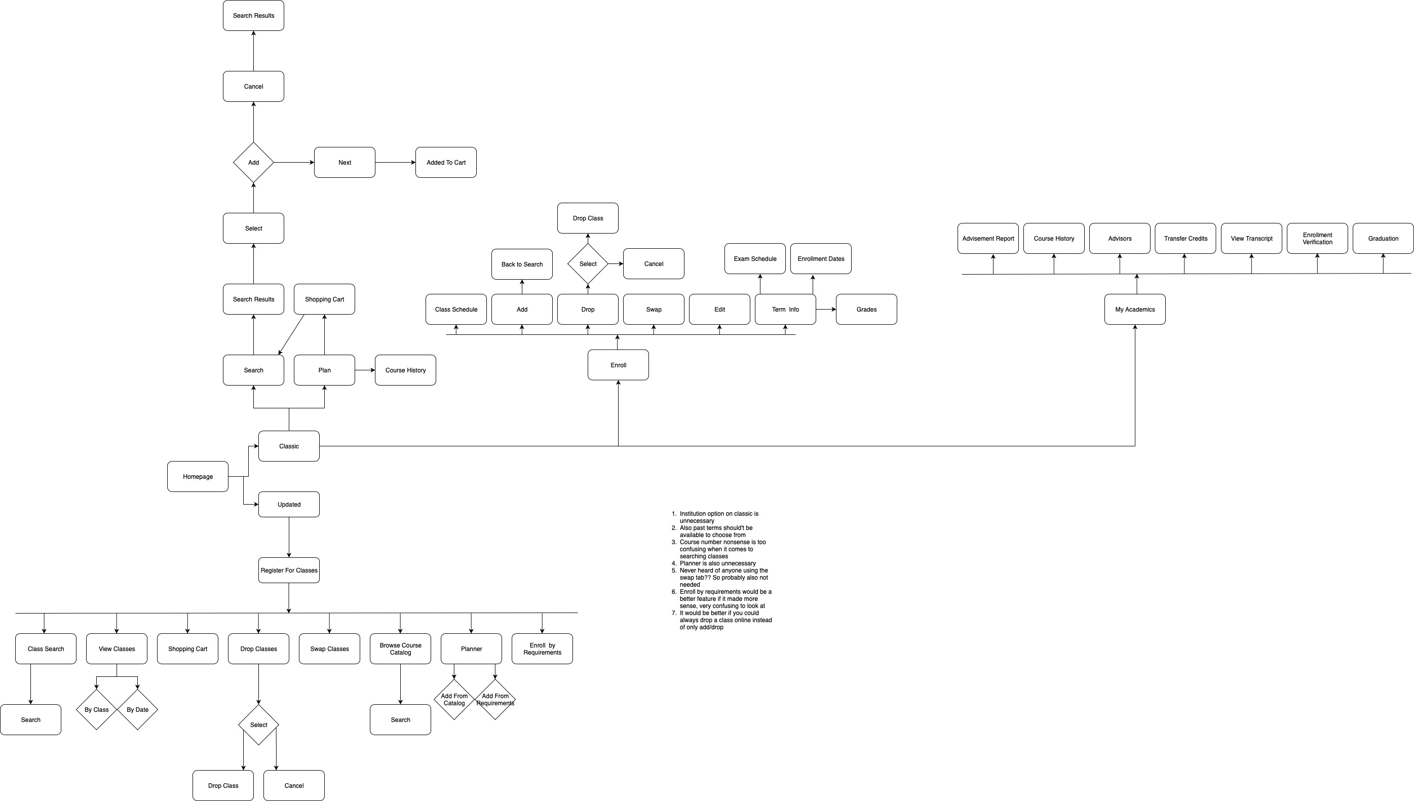
The first step in our process was to do a deep analysis of MyKU's register process and create a process flow of the website showing how ridiculous all of the steps were to register for classes. We also wrote pain points, which are things that were unneccesary.
We then went through extensive research to try to find competitor websites, and other websites that use shopping carts.
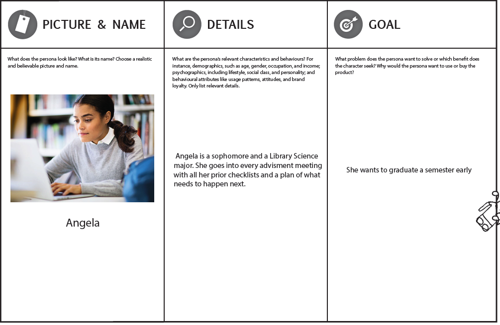
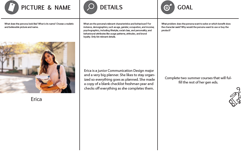
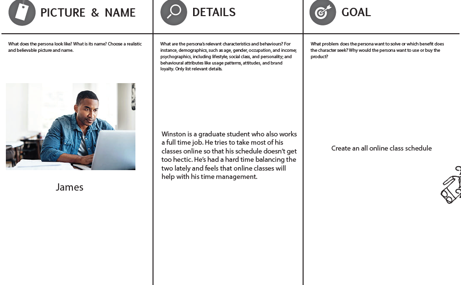
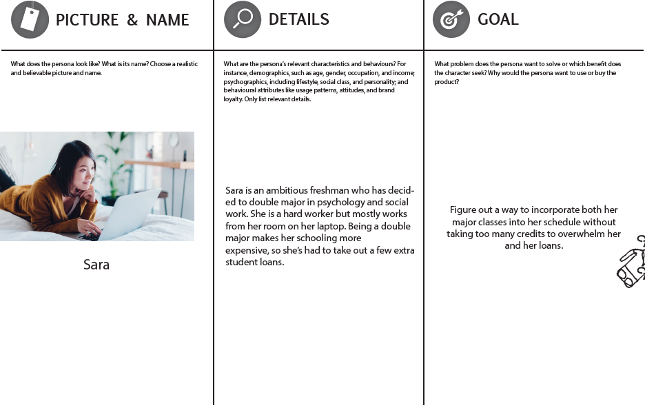
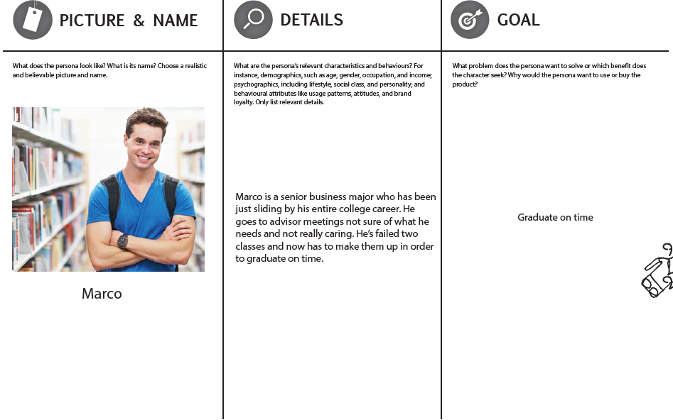
STEP 2:PERSONAS
We then created five different personas of people who would possibly be using MyKU's class registering system.
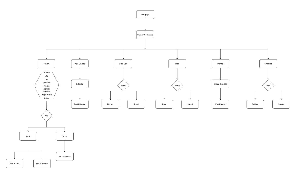
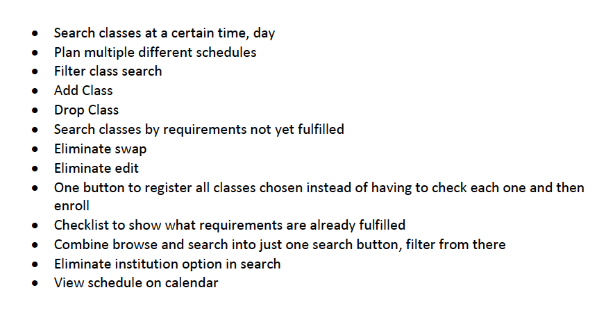
STEP 3: REVISED PROCESS FLOW
We then went back to our original process flow and figured out all of the changes that needed to happen to make this website more user-friendly and easy to use. So we revised our process flows with a new system of how things would happen, along with a list of features.
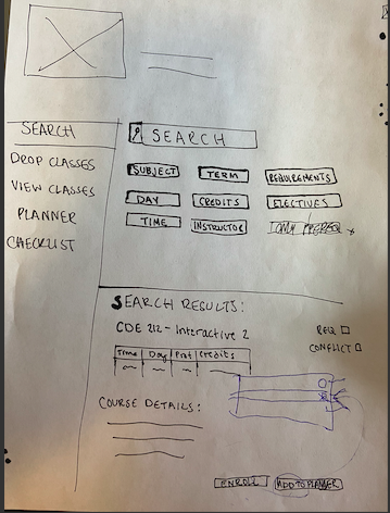
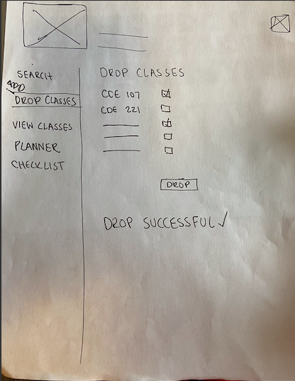
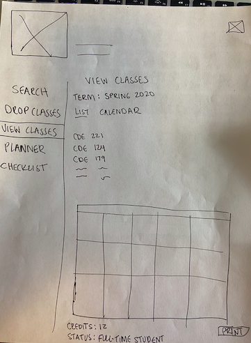
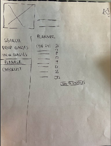
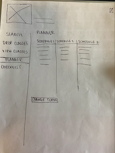
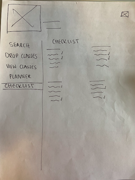
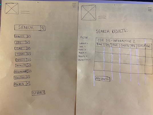
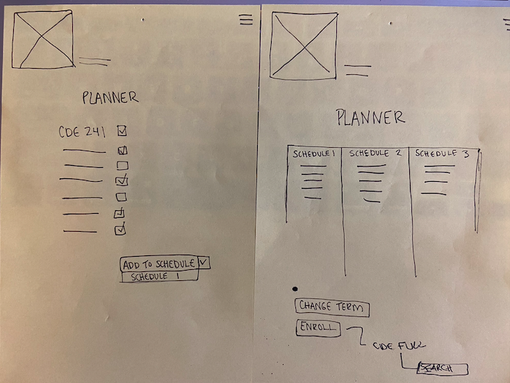
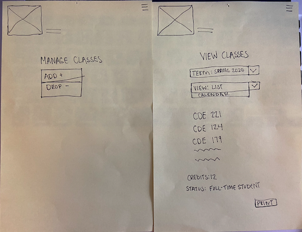
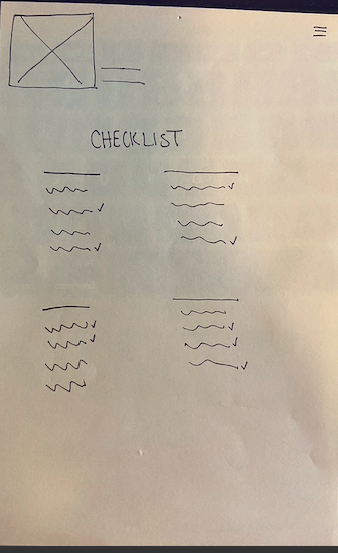
STEP 4: WIREFRAMES
We created a whole bunch of paper wireframes that we reworked and reworked over and over again with classmates. We also created a script of tasks to do on our website.
SCRIPT QUESTIONS
1) Find CDE 277 and add section 020 to your planner.
2) It's your registration period. Quickly enroll in Schedule 1.
3) It's add/drop week and you hate CDE 224. Remove it from your schedule.
4) Add CDE 330 to Schedule 1.
5) Delete Schedule 3 from your planner.
6) After looking at your checklist, you see that you still need a social science course. Find a course that fills this.
7) Find a section of CDE 277 that doesn't conflict with any of your schedules.
8) Add CDE 231 to your current schedule.
9) You haven't met with your advisor and would like to choose classes on your own.
10) Compare all of your schedule options for next semester, Fall 2020.
STEP 5: USER TESTING
We went through three sets of user testing, improving upon the last each time. By the end, I learned so much from our users. It is so important to user test to see how the average person will react and engage your website. Here are the writeups from each user testing. They are notes on what the users would click on, how they would react to certain situations from the script and their feedback on any more improvments for the redesign.
FIRST ROUND
Buttons on mobile don't work!
Went to view classes, then planner instead of manage
Looked at planner to check conflicts with schedules
Question 9 - Too Vague!
New name for Planner
Convert View Classes to Current Classes
SECOND ROUND
Buttons on mobile STILL not working
Change checklist requirements to a dropdown instead of a button
Reword Question 9
STEP 6: PROTOTYPES
After putting everything into UXPin, we created clickable prototypes to be able to user test. Here are screen grabbed, click through videos of how my version of how MyKU would work. I have also embedded both mobile and desktop prototypes here, so you can click through those & follow along with the tasks.
STEP 7: FINAL
After revising my script questions, we did one final round of user testing.
SCRIPT QUESTIONS
1) Find CDE 277 and add section 020 to your planner.
2) It's your registration period. Quickly enroll in Schedule 1.
3) It's add/drop week and you hate CDE 224. Remove it from your schedule.
4) Add CDE 330 to Schedule 1.
5) Delete Schedule 3 from your Schedule Builder.
6) After looking at your checklist, you see that you still need a social science course. Find a course that fills this.
7) Find a section of CDE 277 that doesn't conflict with any of your schedules.
8) Add CDE 231 to your current schedule.
9) You want to be prepared for your advisor meeting by knowing what classes you still need to take. Figure out what those classes are.
10) Compare all of your schedule options for next semester, Fall 2020.
The only feedback received from this final test was that the enroll button on mobile wasn't clickable, which was an easy fix. Overall, users were able to navigate through my site pretty easily.