Wireframes
Part 4 - Starting on Paper
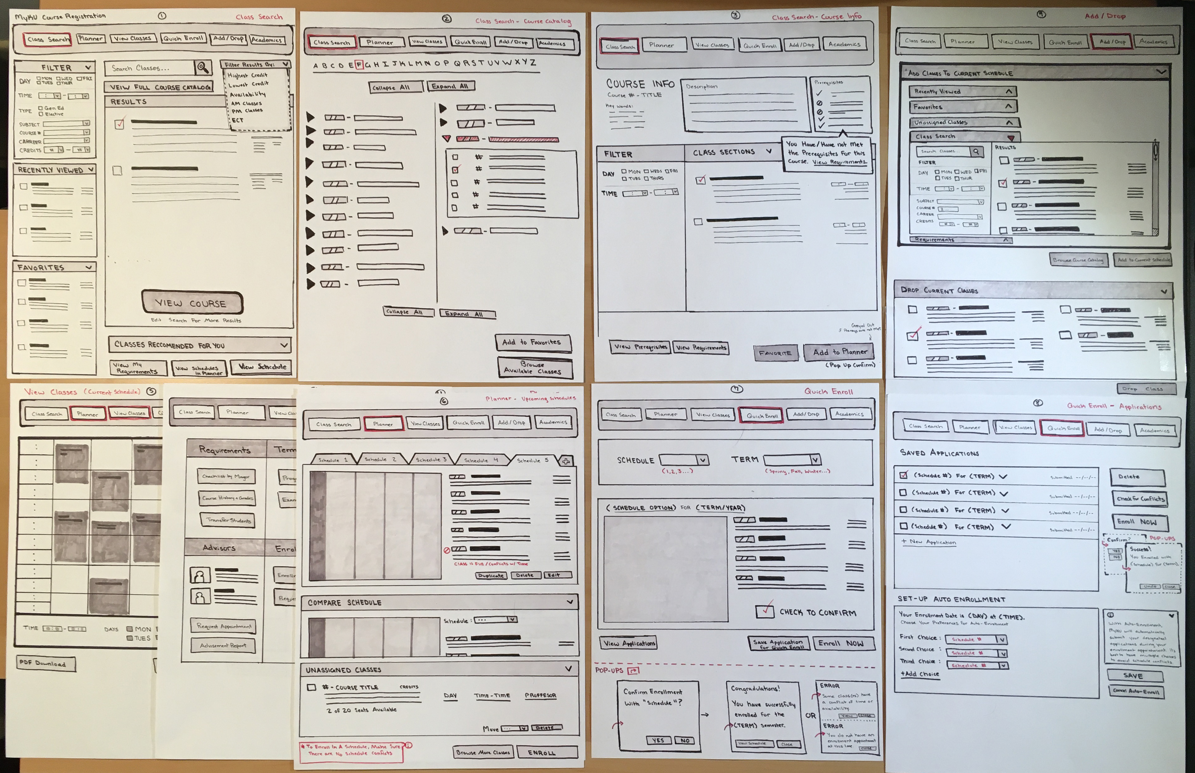
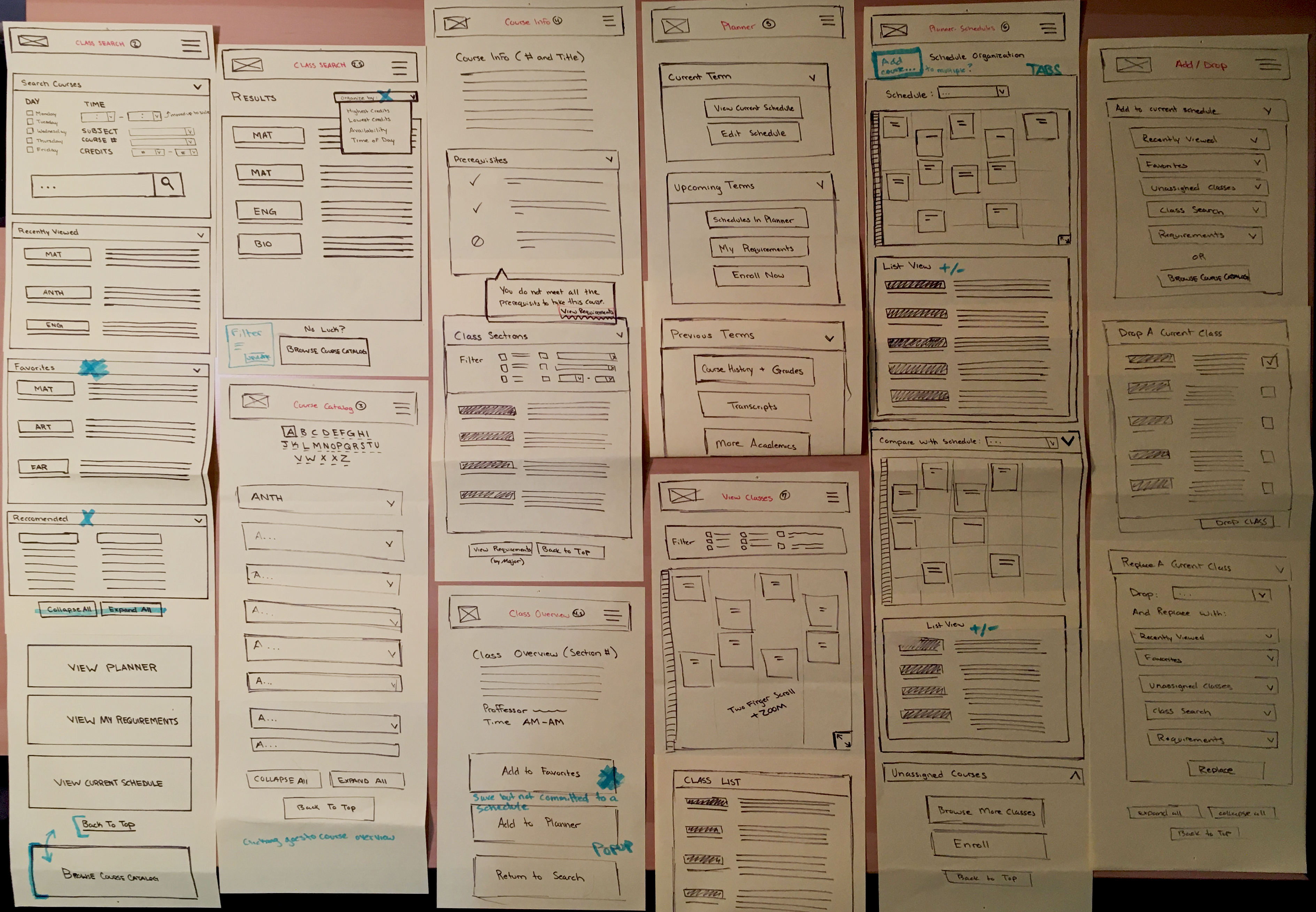
The fourth step in the redesign process was to create a flowchart of the primary and secondary levels of navigation, which was then used as a rough template to create desktop and mobile prototype wireframes on paper. The paper wireframes then went through a revision process based on peer-review and scenario-based critique.
Primary/Secondary Navigation Chart
Desktop Wireframes on Paper
Mobile Wireframes on Paper
Part 5 - Going Digital
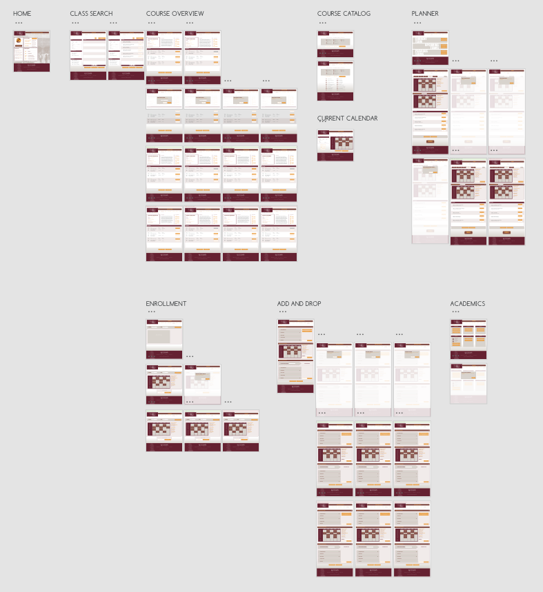
The paper wireframes were then used as reference to create digital prototypes in the online software UXpin. The wireframes were created to be moderately complete and reflect usability goals over choices of aesthetic design.
Digital Desktop Wireframes
Digital Mobile Wireframes
Part 6 - Usability Testing
Participants were asked to complete 10 tasks within the digital prototypes with seven tasks focusing on desktop usability and 3 focused on mobile usability. Three users volunteered for round one and two users volunteered for round two. The results of each test provided feedback for prototype revisions by highlighting moderately flawed usability designs.
Question 01:
"You want to locate the course Introduction to Digital Design and determine if there is a section that takes place on Mondays and Wednesdays at noon. Search for the course and select a class section to add to your schedule for next semester."
Round One
User 01:
Completed the full search process immediately with no guidance. However, they only used the search bar for the wording “Digital Design” and did not utilize the filter.
User 02:
Noticed the filter before searching for classes and entered script information before continuing the search process. Hesitated slightly when the default text for the input bar covered the information that was entered into the input section.
User 03:
Successfully searched for specific class sections and found the course overview for Introduction to digital design, however when the user attempted to add a class by a specific day they returned to the search to utilize the filter, rather than browsing the full list of available class sections. This “solution” took them directly away from what was otherwise a search performed in a linear fashion.
Round Two
User 01:
Proceeded to the search and successfully found the class. User had no trouble adding the course to their planner. This user then proceeded to the planner and the upcoming schedules section without being prompted, presumable to check if the planner reflected their choice (despite being a prototype).
User 02:
Used the search and viewed the course overview. Carefully analyzed each class section and before making a final decision and adding a class section to their planner.
Question 02:
"One of the CDE classes you had previously planned on taking has been filled and is no longer available. You want to find another class for the empty time slot, but you don’t know what classes are available. Find an overview of all Communication Design (CDE) courses."
Round One
User 01:
Did not find the course catalog even after multiple attempts at guidance and probing into the user’s thought process.
User 02:
The user stated that they expected an “overview” to be located within the Academics page of the prototype. When asked what they would want to see in the prototype, they suggested an edition to the class search filter that would allow them to search by major.
User 03:
Searched the term “communication design” to find all classes within that category and stated that any classes within that major would show up in the results. The catalog was not needed in this reasoning.
Round Two
User 01:
Found the course catalog immediately and used the Communication Design checkbox before using the Browse button; Found class easily. However, this could be a fluke when analyzing the changes to the prototype to make this feature more apparent because the user had just previously learned about the course catalog option on the original MyKU website.
User 02:
Clicked on the Quick Enroll navbar button when prompted to find the course overview before navigating back to the Class Search, to Academics, back to Class Search again, and upon their second viewing of the search found the catalog and successfully browsed the CD classes.
Question 03:
"Your advisor has recommended to you in an email that you should take their class section of CDE – 271 that is being taught in the fall, but they didn’t include the full name of the course. Locate the course CDE – 271 and determine the name of the course."
Round One
User 01:
Used the course catalog to identify a class by its course number, however the user was already on the course catalog page when asked to identify the course CDE – 271. It is unknown if the user would have succeeded as easily if not already on the course catalog page.
User 02:
After wanting to search for classes by major in the filtered class search, this user decided that they could identify the course by searching the term “CDE - 271” and viewing the course overview rather than scrolling through the course catalog for identification. The catalog was not referenced.
User 03:
This user, like user 2, also tried to identify CDE – 271 through the class search process. When guided towards the course catalog, they stated that it was an unnecessary tool.
Round Two
User 01:
Found the course easily from their experience with the catalog in question 02. It is unknown if they would have utilized the search if not previously prompted to view the catalog.
User 02:
This user also used the catalog to find the course, but they were already on the catalog page.
Question 04:
(Asked on Mobile)
"It’s Add/Drop week. You’ve taken too many credits and you want to remove a class from your schedule. Remove “Graphic Design 2” from your current classes."
Round One
User 01:
Again navigated to the course catalog despite not using it in previous tasks, however this time failed with the task at hand. The user then proceeded to the Add/Drop section and, after hesitating to scroll further, found the “drop class” function. However, the user got confused by their options in the drop-down menu and did not finish dropping a class selection.
User 02:
Attempted to click on the calendar-view thumbnail located within the “drop class” function on the Add/Drop page. This user stated that they would like to see the visual be more interactive and didn’t like scrolling as far as what was needed to complete the process.
User 03:
Found the “drop class” function quickly and proceeded to drop a class with no problems.
Round Two
User 01:
Navigated to the Add/Drop page and scrolled down to the Drop Classes section. Attempted to click the calendar visual to select the class before using the drop-down selection. Dropped the class with little complications.
User 02:
Navigated to the Current Calendar page to view classes but did not read buttons at first (most likely scanning the calendar). Found the Edit Classes button and navigated to the Add/Drop page before scrolling down and dropping the class with ease.
Question 05:
"Upon viewing your classes, you realize that you are falling behind on general education credits and that you should be more prepared for next semester. Compare your upcoming schedules to determine which one would allow you to take the most gen-ed classes (compared to classes specific to your major)."
Round One
User 01:
Had little issue navigating to the planner section of the prototype, however they became caught on the tabs function of the schedules rather than scrolling to utilize the comparison function shortly after the tabs on the same page. They believed it would be quicker to switch between tabs to compare schedule calendar thumbnails rather than listing both on the same screen and scrolling between the two.
User 02:
This user had the same issue as user 1 and thought that scrolling was unnecessary.
User 03:
Navigated to the Current Calendar page of the prototype to compare upcoming schedules, but then changed their mind due to the word “current”. They then found the full comparison function within the planner and did not question the scrolling element.
Round Two
User 01:
Navigated to the Planner and the Upcoming Schedules. Wanted to use the schedule tabs to compare their option before noticing the comparison section by scrolling down further. It is unknown which method the user would prefer.
User 02:
Proceeded to the Upcoming Schedules section in the Planner and scrolled down immediately. Performance for this task was flawless.
Question 06:
(Asked on Mobile)
"You need to attend an advising appointment to have your class enrollment unlocked, but you are unsure of the name of your advisor. Locate information about your advisor and find the information for the location of their office and their email address."
Round One
User 01:
Found advisors quickly with no issues.
User 02:
Also found advisors quickly and with no issues.
User 03:
No hesitation or problems finding advisement information.
Round Two
User 01:
Navigated to Academics and immediately found their advisors information.
User 02:
Completed the task very quickly through the Academics page, no issues.
Question 07:
"Enrollment dates are coming up shortly, and you want to be prepared for a fast selection when your time slot arrives. You think you want to enroll with Schedule 1, but you aren’t sure. Save your enrollment preferences so that you can enroll with Schedule 1 at a later time."
Round One
User 01:
Attempted to enroll from the current courses section of the Planner but did not scroll far enough to find the link to quick enrollment on the page. This was followed by navigating to the Current Calendar, with no links to enrollment. This user avoided the enrollment button on the planner page itself, and upon finding the quick enrollment proceeded with the full process rather than saving settings for later.
User 02:
Unlike user 1, this user first navigated to Quick Enroll for a moment before navigating back to the Planner. When probed for their thought process, they argued that the Planner would be the place to save their preferences, while enrollment would solidify their choices.
User 03:
Went to Quick Enroll and had no trouble updating the information with their preferences and saving the information. However, they became confused when the feedback for this process was hidden lower on the screen and was unable to be seen without scrolling.
Round Two
User 01:
Navigated to the Quick Enrollment page but did not update their selection. Instead it was avoided because the user “did not want to enroll right away” and was looking for something that more closely resembled settings. The user navigated to the planner and proceeded to click the large Enroll button at the bottom of the page, which returned them to Quick Enroll. The user then navigated to the Academics page before giving up and did not complete this task.
User 02:
Navigated to the Planner and had the impression that the Unassigned Classes section was their saved preferences. The user then went to the Add/Drop page before returning to the Planner and attempting to edit a schedule. When asked, “What would you try next?” the user navigated to Quick Enroll and updated their selection but enrolled with their schedule rather than saving the selection. The user explained that they originally did not want to go to Quick Enroll because it seemed like an option to “enroll now” rather than later. They also suggested that there should be an enrollment option on each schedule tab within the Planner, which would auto-fill their selection on the enrollment page but could be changed manually with the update button.
Question 08:
"It’s your time to enroll in a few minutes, and after comparing schedules you’ve decided you want to enroll. Complete the full enrollment process with the semester and term of your choice."
Round One
User 01:
This user completed this task when attempting to save their preferences for a later time and was not asked to repeat the enrollment process when acknowledging the mistake.
User 02:
Originally navigating to the Planner for enrollment in the previous testing, this user had trouble finding the correct tools for the enrollment procedure. They suggested that enrollment should be available on each individual tab when looking at schedules within the planner, rather than scrolling down to a button or navigating to a new page. This is a useful consideration.
User 03:
Completed the enrollment process with no hesitation, although they were once again confused by the placement of the feedback for the process.
Round Two
User 01:
Enrolled easily with the Quick Enroll page despite not using the age t previously save their enrollment selection for later.
User 02:
Enrolled easily after their experiences in question 07.
Question 09:
"You want to take the CDE course Introduction Digital Design, but you don’t know if you meet the prerequisites. Check that you meet the course requirements before trying to add a class section to your schedule for next semester."
Round One
User 01:
Found the prerequisites quickly through the class search with no issues.
User 02:
Correctly assumed that the course overview would show the prerequisites of each course and navigated to the overview for Introduction to Digital Design.
User 03:
Although this user viewed the course overview for Intro to Digital Design in a previous task, they navigated to the Add/Drop section of the prototype before changing back to the Class Search. Curiously, despite avoiding the course catalog and rendering it useless in a previous task, this user used the catalog to find the course in a list-view. The user reasoned that the catalog would link to a course overview for each list item, however this was not built into the prototype at the time.
Round Two
User 01:
Navigated to the course catalog to find the course overview in the listing, however the classes in the catalog were not linked to their corresponding pages at the time. The user then wanted to compare the course overview to a section of the Academics page: Course History and Grades.
User 02:
Used the Class Search to find the course and its overview, easily identifying the prerequisites section of the page.
Question 10:
(Asked on Mobile)
"You got carried away adding classes to your upcoming schedules, and now there are several classes that are unassigned. Delete CDE 151 – Introduction to Illustration from the list."
Round One
User 01:
Did not find the unassigned classes right away and needed probing on where they thought this function might be located. This user wanted to edit their schedule to drop classes despite the classes not being assigned to any schedules and took a long time to realize that the unassigned class list was located further down on the page.
User 02:
Found the unassigned classes list after only a slight hesitation. This user stated that the unassigned classes needed more context, and would have liked the list to be called, “Saved to Planner”.
User 03:
Navigated to the Add/Drop page to drop unassigned classes, which shows unassigned classes in the “add class” and “swap classes” functions but not within the “drop class” function. It was unclear that dropping an unassigned class from the Planner was unrelated to dropping a class in which the user was currently enrolled.
Round Two
User 01:
Navigated to the Planner page and Upcoming Schedules and scrolled down to Unassigned Classes; Completed the task with very little hesitation.
User 02:
Navigated to their Upcoming Schedules and asked for the question to be repeated. Found the Unassigned Classes section, described as “all the way at the bottom of the page”, and easily deleted a class section from the Planner.
Top Usability Issues In Round One
Problem 01: The Course Catalog
The number one usability issue of this round of testing is the function of the course catalog. The function is technically shared by the class search and rendered useless by 2/3 users that were tested, although these users did not find the catalog and were not told about it after their reasoning for their own course identification methods that produced the correct results. Perhaps the course catalog could be removed, on mobile at the very least, or given a much more prominent place within the page hierarchy with more relevant phrasing other than “browse course catalog”.
Problem 02: Scrolling (and Feedback)
Many of the website’s elements cannot be seen without scrolling past other elements on a page. This means that users end up lost or unable to complete a task. Most noticeable in this case is the use of feedback on the website; Feedback cannot be seen on some pages without scrolling, leaving the users confused and feeling lost within the processes of the website. The notifications for success or failure should be moved to a much higher position on the page, but the size of each notification is not part of the problem. Additionally, it may be useful to give other elements on the site their own pages to ensure that important content is not lost under the “fold”.
Problem 03: Clarity of Terms
All three users became confused at some point when the terminology they expected to correlate with a task did not match the terminology of content presented to them within the prototype. It would be very useful to future users to redefine the terms of many sections or processes so that it matches the user’s expectations. However, this will need to be determined over multiple sessions of testing to narrow down what users “expect” and what makes sense in an individual’s thought process.
Problem 04: Visuals
The section for comparing schedules on the same page may be preferred by some users to have a visual element for a side-by-side comparison, however on the desktop version of the prototype this function was ignored or deemed unnecessary. Perhaps this would be different on mobile where screen space is more limited, and tabs are replaced by drop-down menus. This is not an item of concern at the time.
Top Usability Issues In Round Two
Problem 01: The Course Catalog
SOLVED
Users in this round of testing were much more perceptive of the course catalog and used it to complete various tasks, some of which where the catalog was not needed but provided indirect solutions to a problem, providing a tool for users to use outside of the intended process.
Problem 02: Scrolling (and Feedback)
SEMI-SOLVED
Users were able to identify feedback and confirm whether a task had been completed or not. However, some sections on pages within the prototype were still lost at the bottom of the page, reachable only by scrolling a great amount.
Problem 03: Clarity of Terms
NOT SOLVED
All users still became confused at some point when the terminology they expected to correlate with a task did not match the terminology of content presented to them within the prototype. This problem was most apparent with the Quick Enrollment page, where the name of the page caused users to avoid it when dealing with the planning phases of enrollment. This term should be changed immediately.
Problem 04: Visuals
NOT SOLVED
The section for comparing schedules on the same page may be preferred by some users to have a visual element for a side-by-side comparison, however on the desktop version of the prototype this function was ignored or deemed unnecessary. Perhaps this would be different on mobile where screen space is more limited, and tabs are replaced by drop-down menus. This is not an item of concern at the time.
CONCLUSION
Clarity of terms must be addressed to more closely reflect what users expect from each section. Some sections are only available through an inconvenient amount of scrolling, confusing users. Some sections may be deemed unnecessary by users on one platform versus the other (desktop vs mobile).