DOCUMENTATION SITE
This site represents a redesign of the MyKU enrollment site. Below are the steps to make the site easier and efficient for every student to enroll for classes.
STEP BY STEP PROCESS
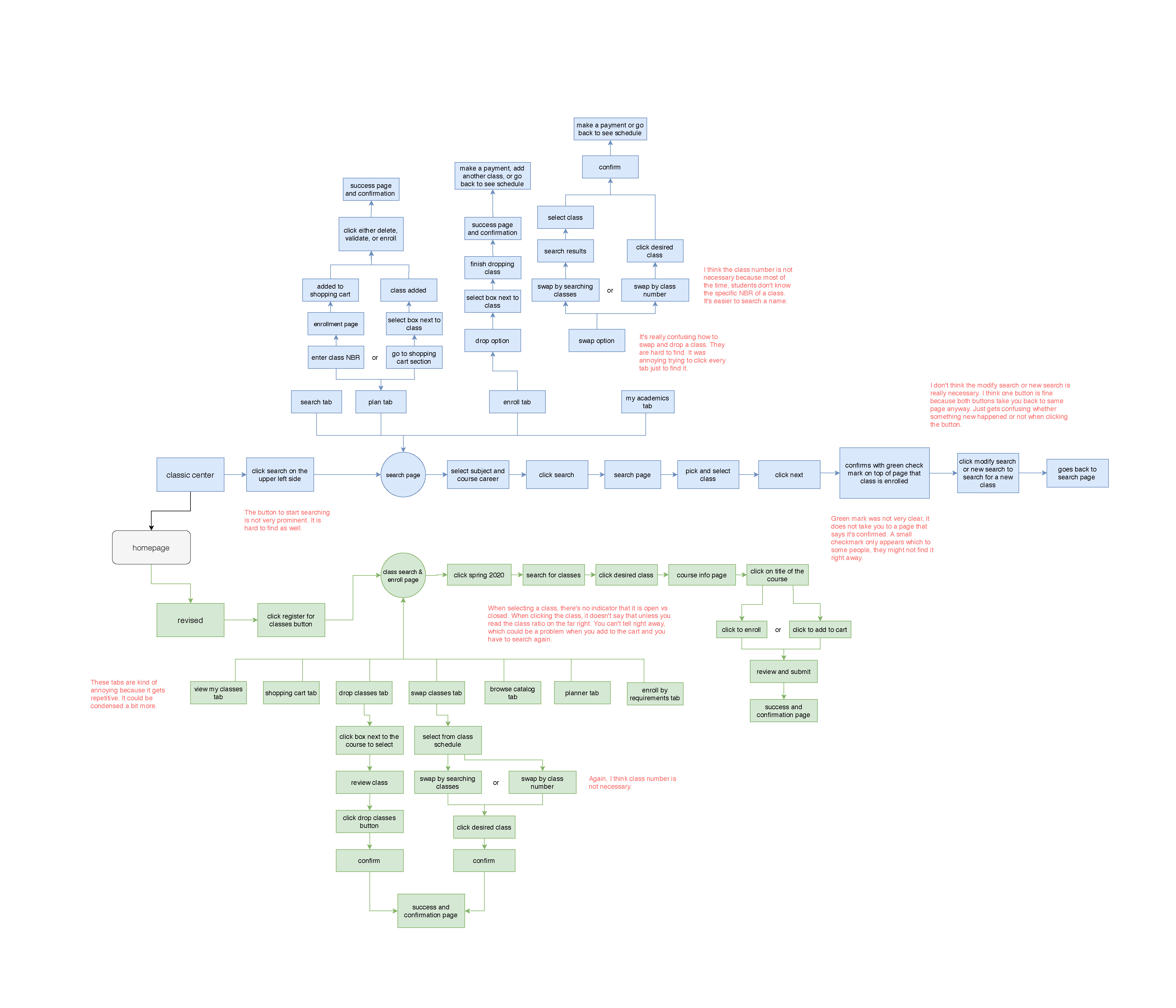
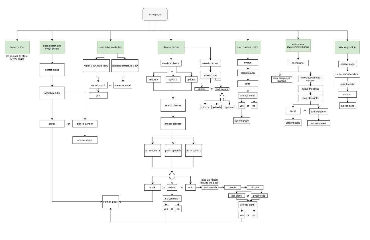
The first step to fix the website was to analyze and create a process flow that explains the way the MyKU website works. This gives an insight to how students navigate through enrollment. Both Classic Center and the New Revised website is shown and compared in this chart as well as the pain points of each version.
COMPETITIVE ANALYSIS
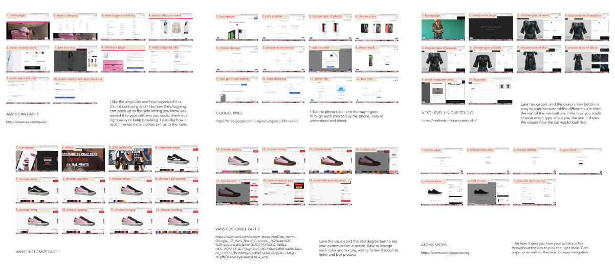
Next, we analyzed websites that were competitors and studied its form to help with the MyKU redesign.
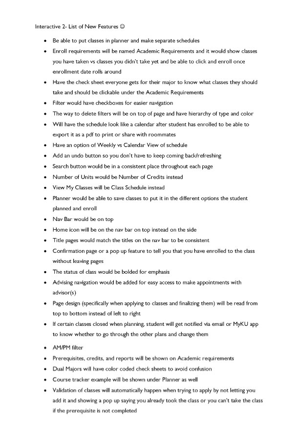
PERSONAS AND FEATURE LIST
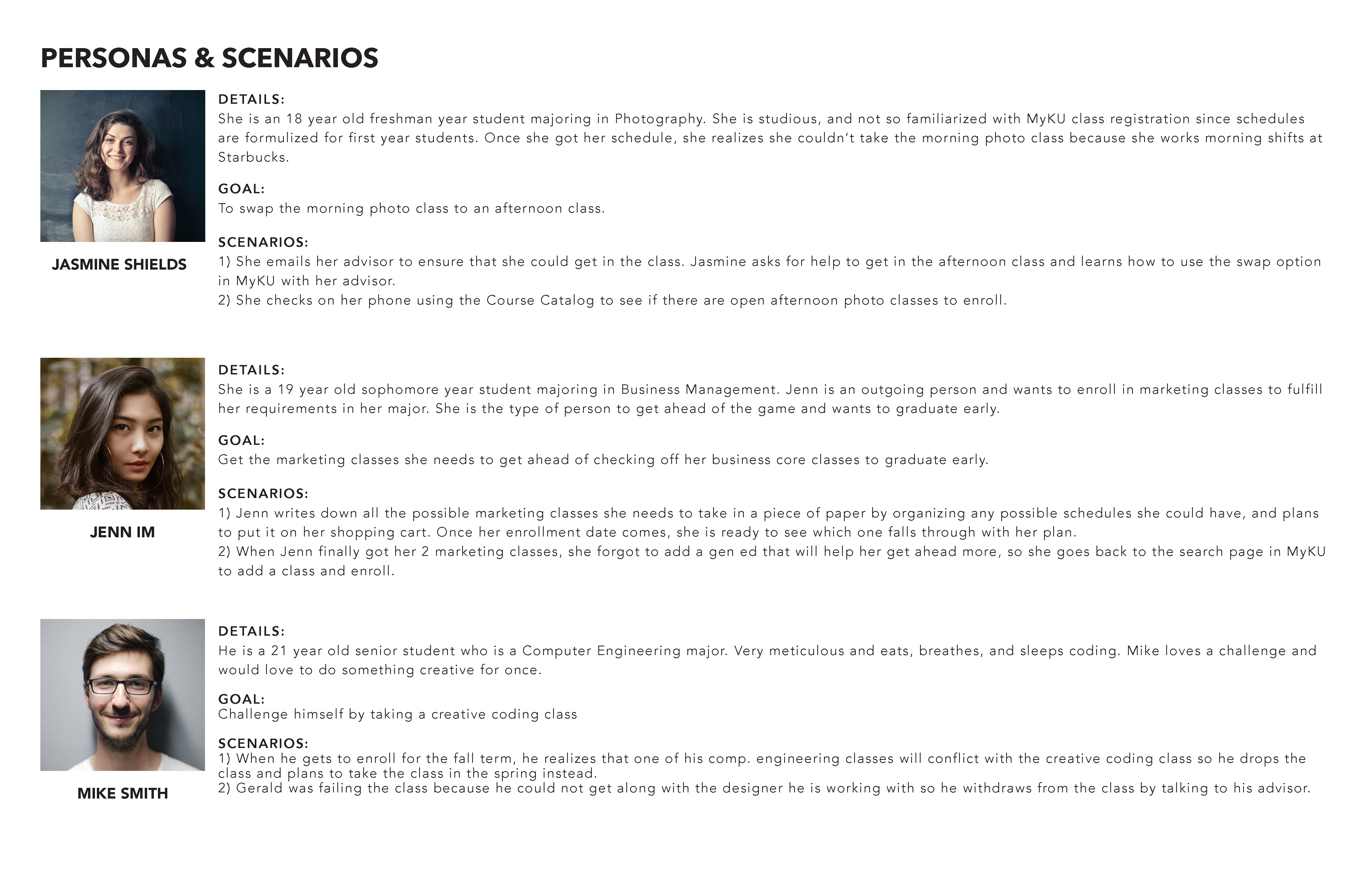
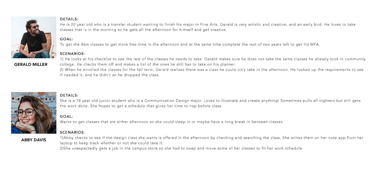
These show personas of what kind of audience would use this website and their goals. The feature list is about the new attributes and solutions to make MyKU have better navigation but still keeping the same concept of the website.
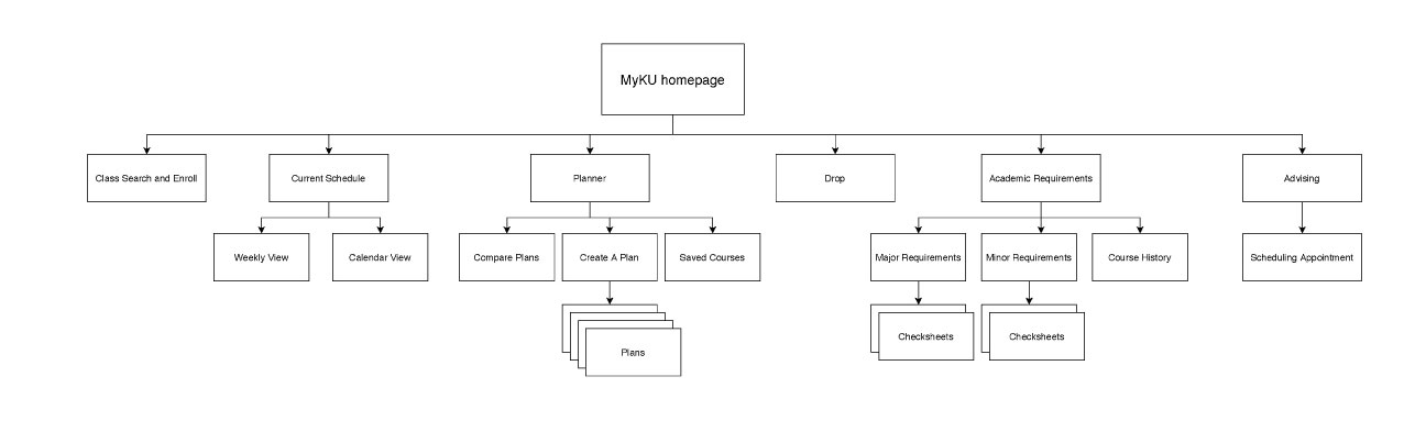
SITEMAP AND REVISION
This is the overall map of the site and revision of the flowchart from the beginning of the process. I revised the way each page is organized after the critique to reference for the wireframes.
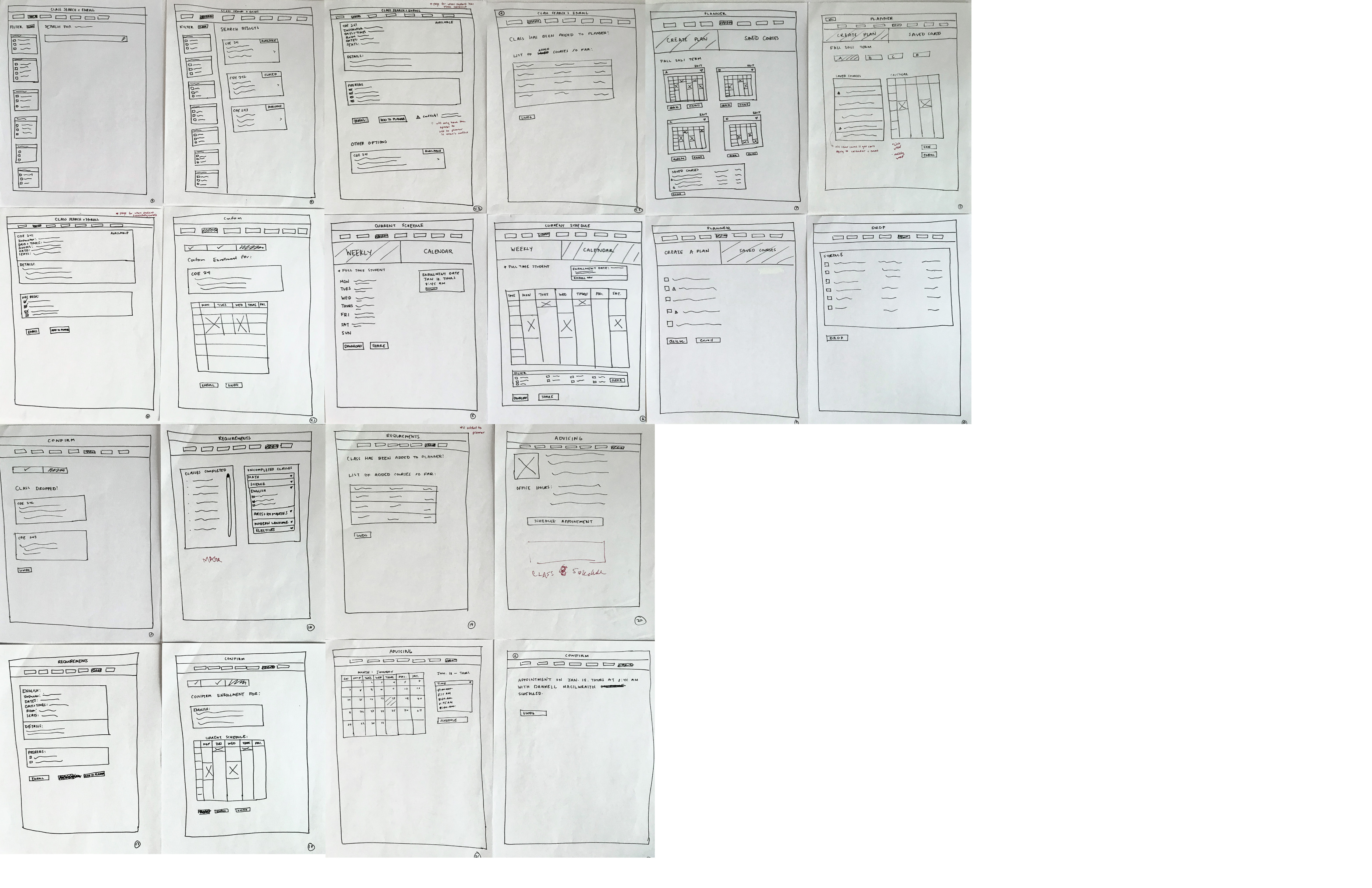
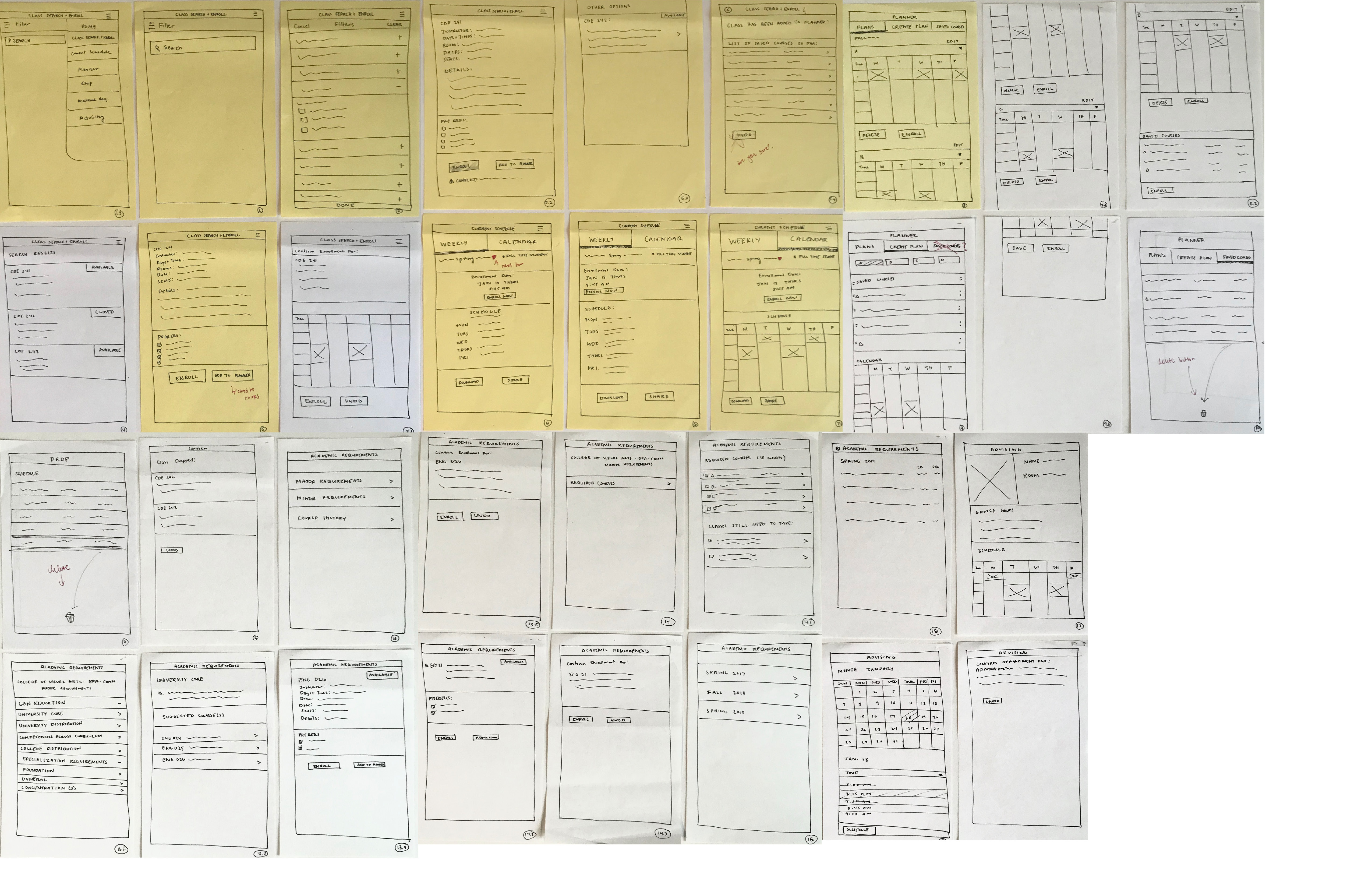
PAPER WIREFRAMES
These wireframes were revised a couple of times after each group critique. Text hierarachy, navigation buttons, and organization of each main page were revised a couple of times for both desktop and mobile. It is important for the wireframes to be able to pass 10 scenarios each critique. First set is desktop and second set is the mobile wireframes.
USABILITY SCRIPT
Before testing the design, I wrote 10 scenarios to test the usability of my wireframes. These were revised a couple of times as well each critique.
Revised Testing Script:
Desktop
1) You want to send your weekly schedule to your roommate so they’ll know when is best time to contact you, and hang out during break time.
2) You want to only find a design class that is online. Find CDE 140 as an online class and complete.
3) Find a core class that is a writing communications class at 8AM-9:50AM that is based on your prerequisites for your major.
4) Find how many credits you need yet to complete and graduate.
5) You’ve already arranged different types of schedules and have it on your planner. You can’t take night classes because of work. Find that schedule that will work best for your situation and complete it.
6) You are curious to see the classes that you took in the past Fall 2019 semester. You want to see the classes you had before because you liked the times in that schedule and would love to have a similar schedule like that for the next Spring 2020 semester.
7) Add CDE 242 but changed your mind about registering. However, you want to come back to it later on just in case you change your mind. How could you add it to your schedule so you could register later?
Mobile:
1) Add class CDE 242 in your schedule for the next semester. This class is offered Mon/Wed at 8:00am-10:50am. Add it to your schedule.
2) Show me how you could set up an appointment on a Thurs at 8:15 AM with your advisor to adjust your schedule.
3) You would love to drop CDE 242 before drop week ends. Show me how you could drop the class before drop week without any conflicts.
After a few usability tests, here are some results I found that were cumbersome to the testers.
1. It was very hard for them to understand how to navigate through the filters. Partially, I feel it's because we tend to search first and filter out our search when we are trying to find something. Adobe XD could only do so much when it comes to linking each page of the prototype and I feel that if I could've programmed it where they could type and search first, it would resolve the problem.
2. Some people misunderstood the prerequisites question because most people think to go to class search and enroll, not go to the academic requirements page to enroll there. I revised that question a bit and it did resolve the problem.
3.Planner was a total confusion in the first usability testings. I think it's because people really didn't know what the purpose of planner before. So when I asked about enrolling through it, they did not know where to look. After revising the question a bit more, it helped in some of the other testings.
PROTOTYPES
CONCLUSION
Overall, I learned a lot on UX design and how it is important. It's not just designing something beautiful, but also the usability of it. Remember: "Don't Make Me Think!"
By Elline Santos