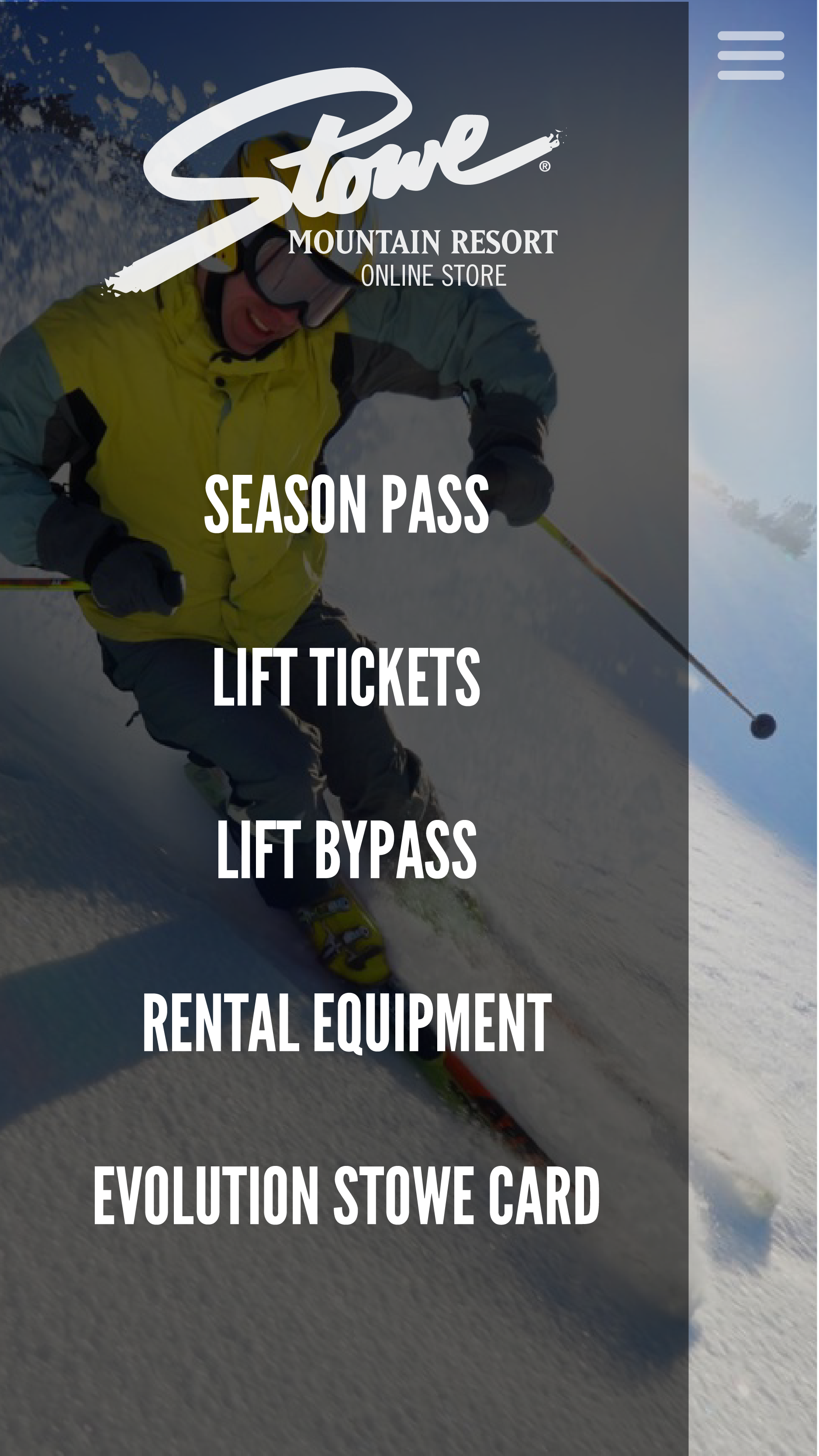
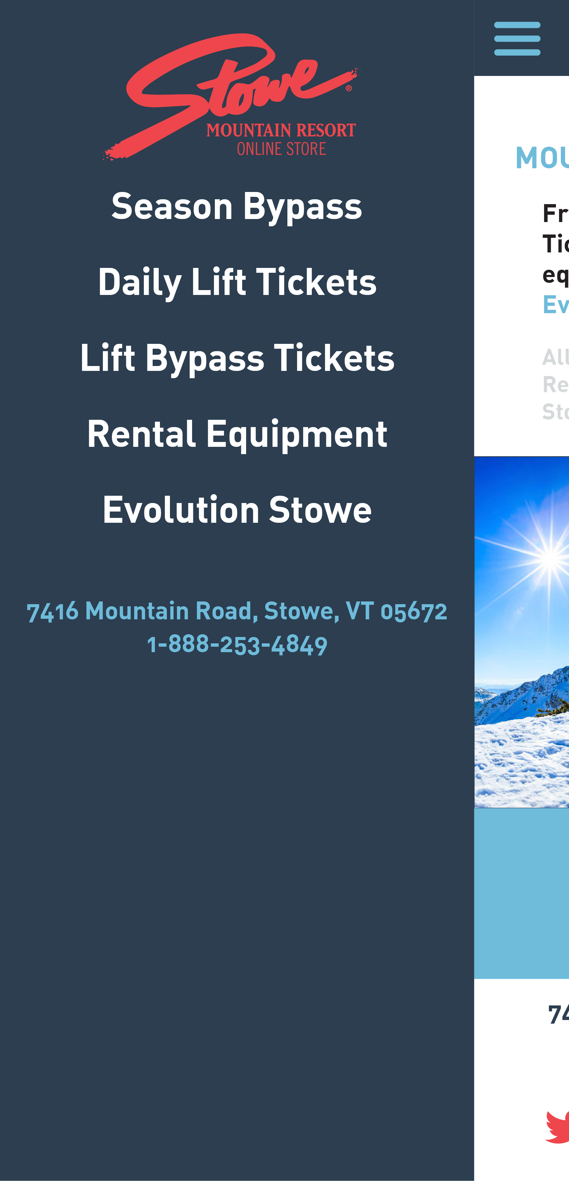
- SEASON PASS
- LIFT TICKETS
- RENTAL EQUIPMENT
- EVOLUTION STOWE CARD
-
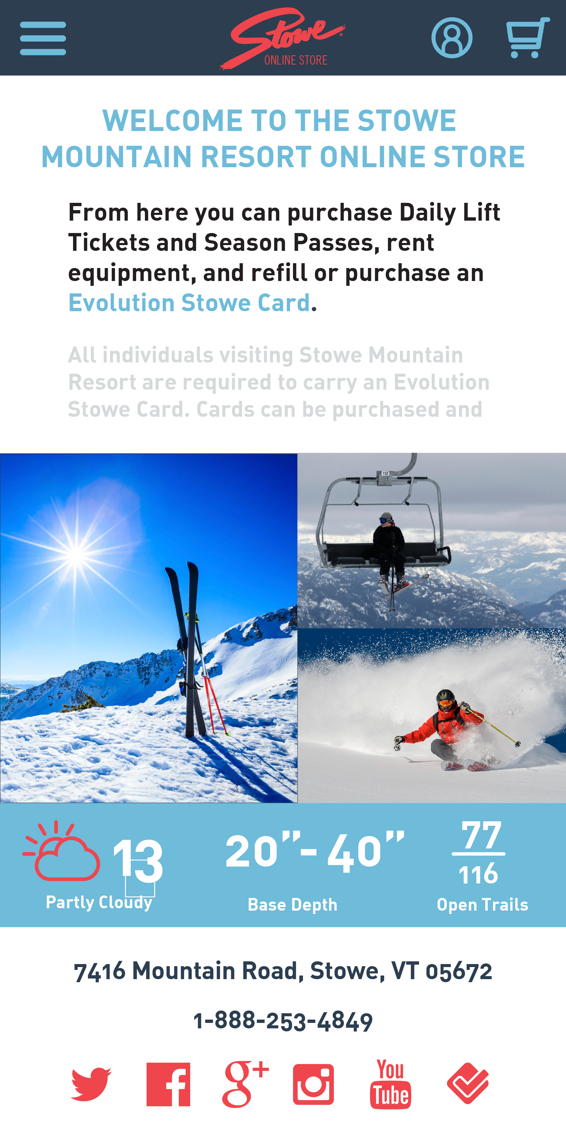
7416 Mountain Road, Stowe, VT 05672 1-888-253-4849
The first step to the UX process was to evaluate the site in its current state to find the "pain points" and inderstand what the site is about.

Overall site organization was confusing.
Most prices do not show correctly.
There are an insane amount of pages to tab through to create a new account.
The check out is too long and confusing.
The site fails to inform the buyer about the Evolution Stowe Card, which is necessary to access the resort.
It is difficult to compare prices, plus there is a lack of description of the different items.
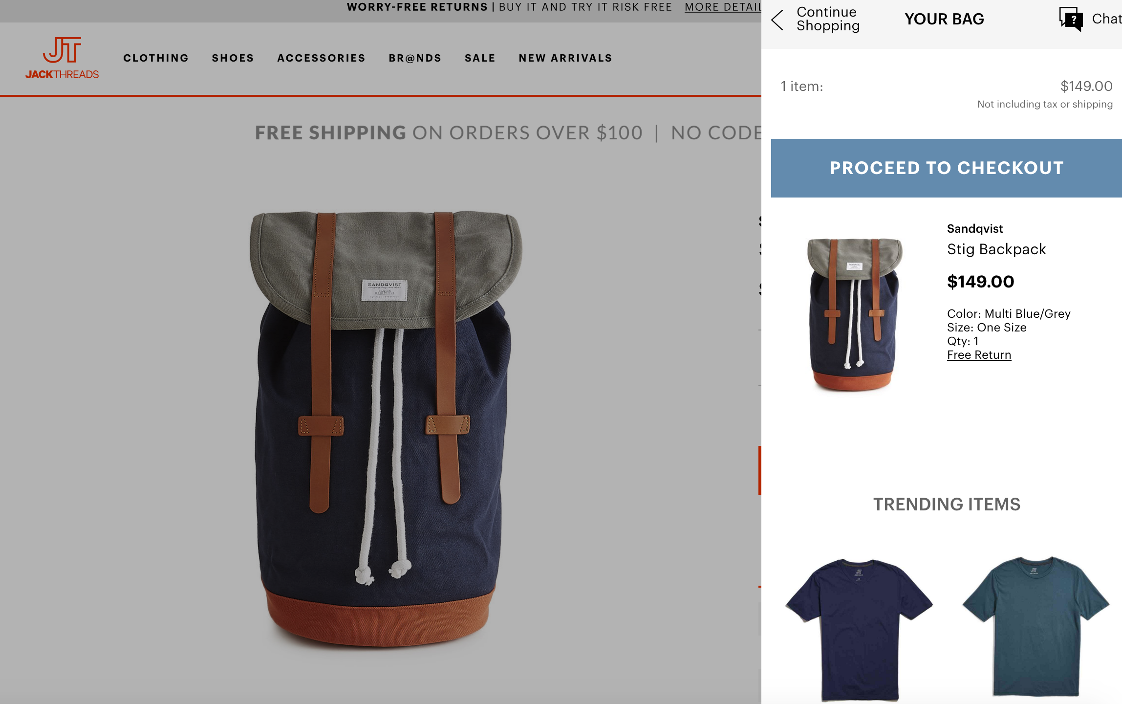
Next, I analyzed other online stores (not necessarily competitors) to see what kinds of elements work and what's trendy. Also this is useful to possibly bring those elements into the Stowe site.
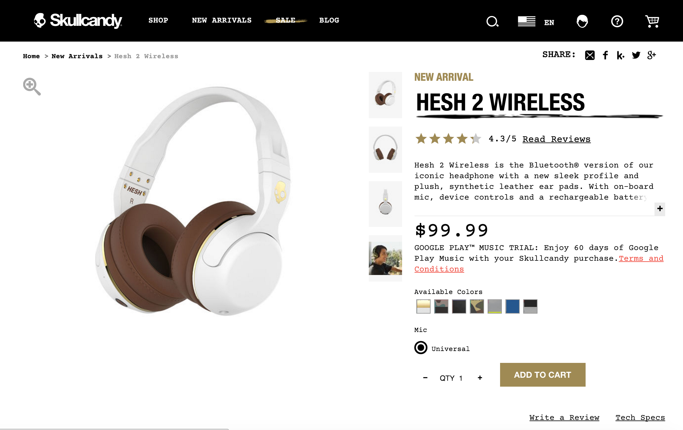
The item page has a lot of information and options clearly shown.

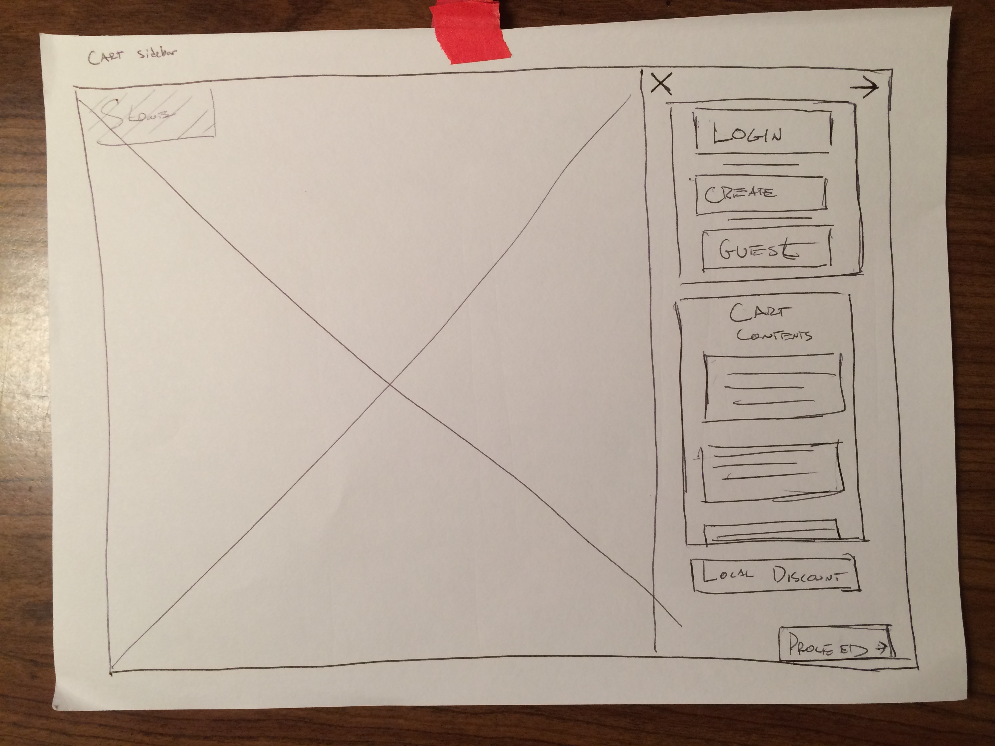
The cart is nice and can be easily accessed and hidden at any time while shopping.
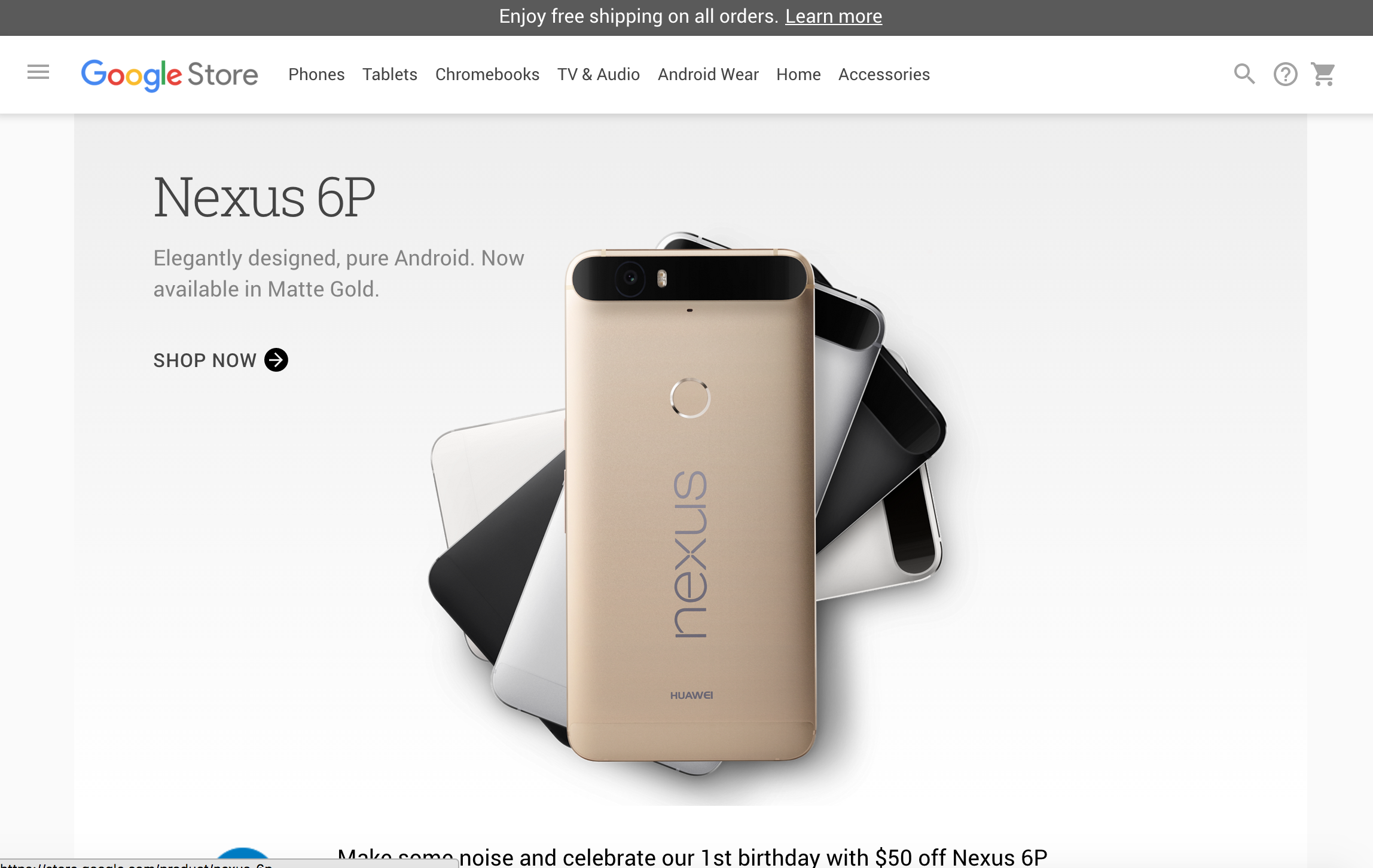
This site has a simple, clean design that's easily navagitable, it also has an off-canvas cart sidebar.
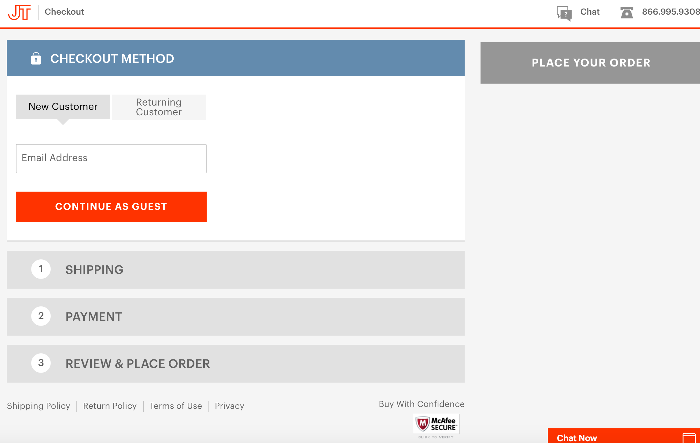
The check out process is organized in collapsing sections, making it easy to go back to previus steps.
Like the others, this site is simple and straightforeward.
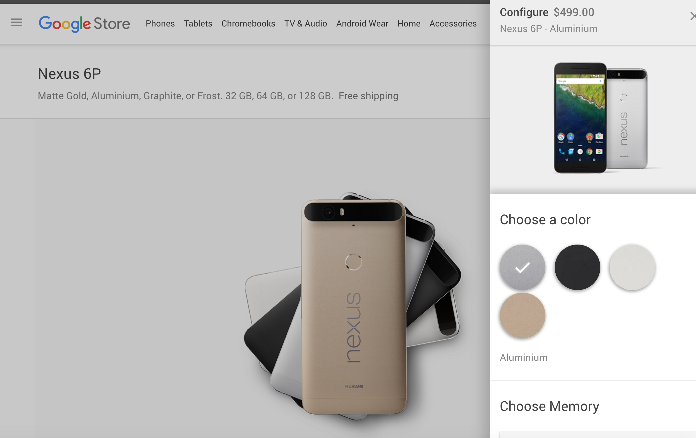
The product infomration pops out from the side of the screen to select options. The check out process is simple
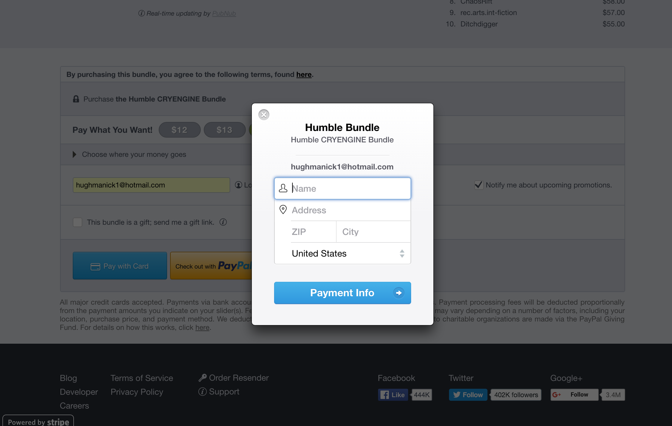
This site is unusual, as the only thing the site requests is contact information and billing in a small modal. Its very fast and efficent.
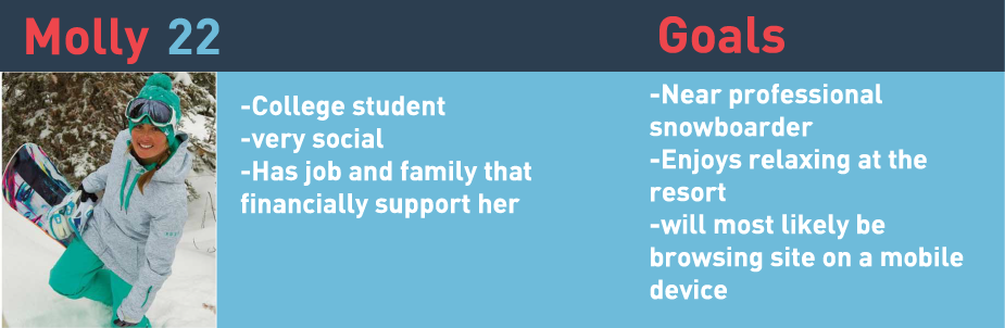
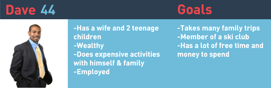
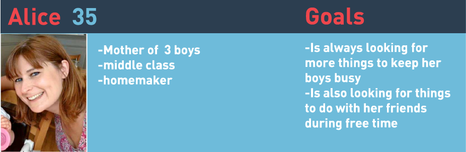
Personas are necessary to try to understand your audience— who will be visiting this site?


The scenerios further explored the issues with the current site, targeting specific users and specific operations.

This is the final map of the process through the redesigned site. I wanted to keep the flow as simple as possible so customers will not get confused or lost.

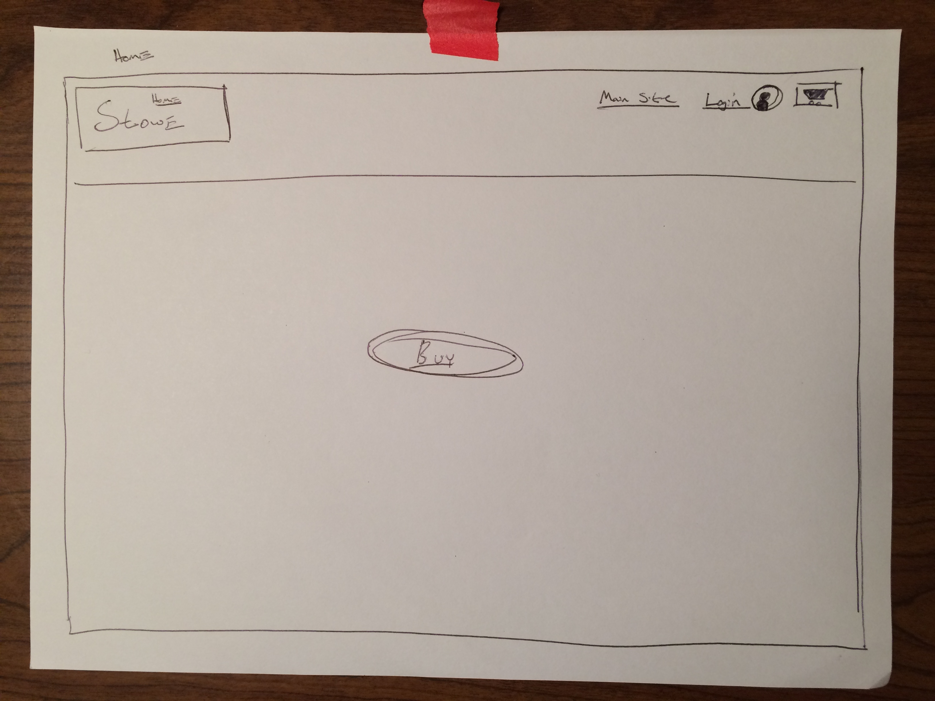
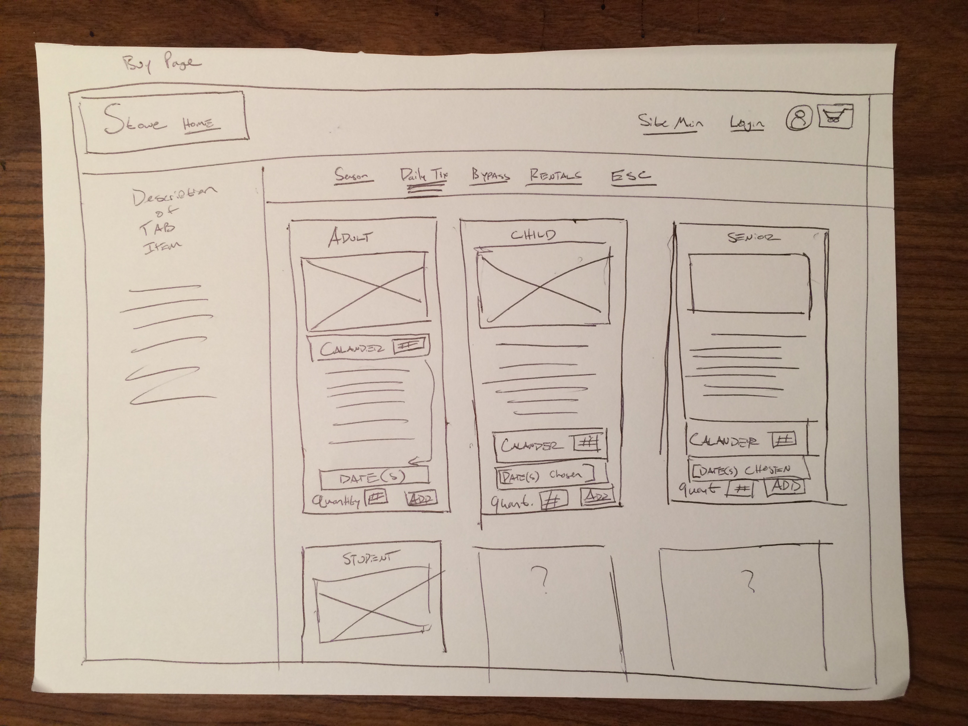
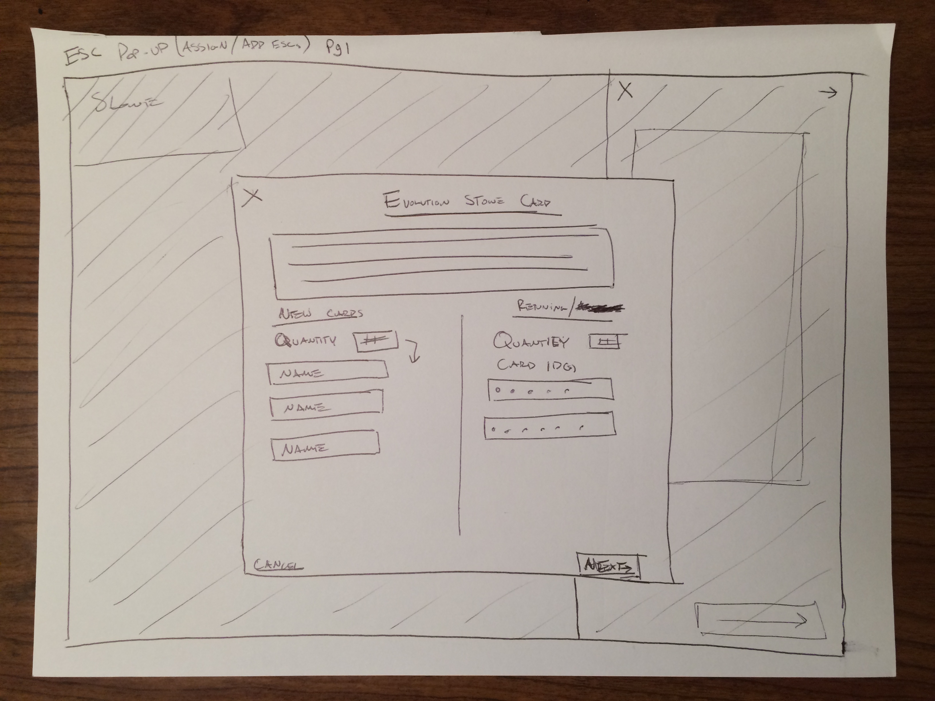
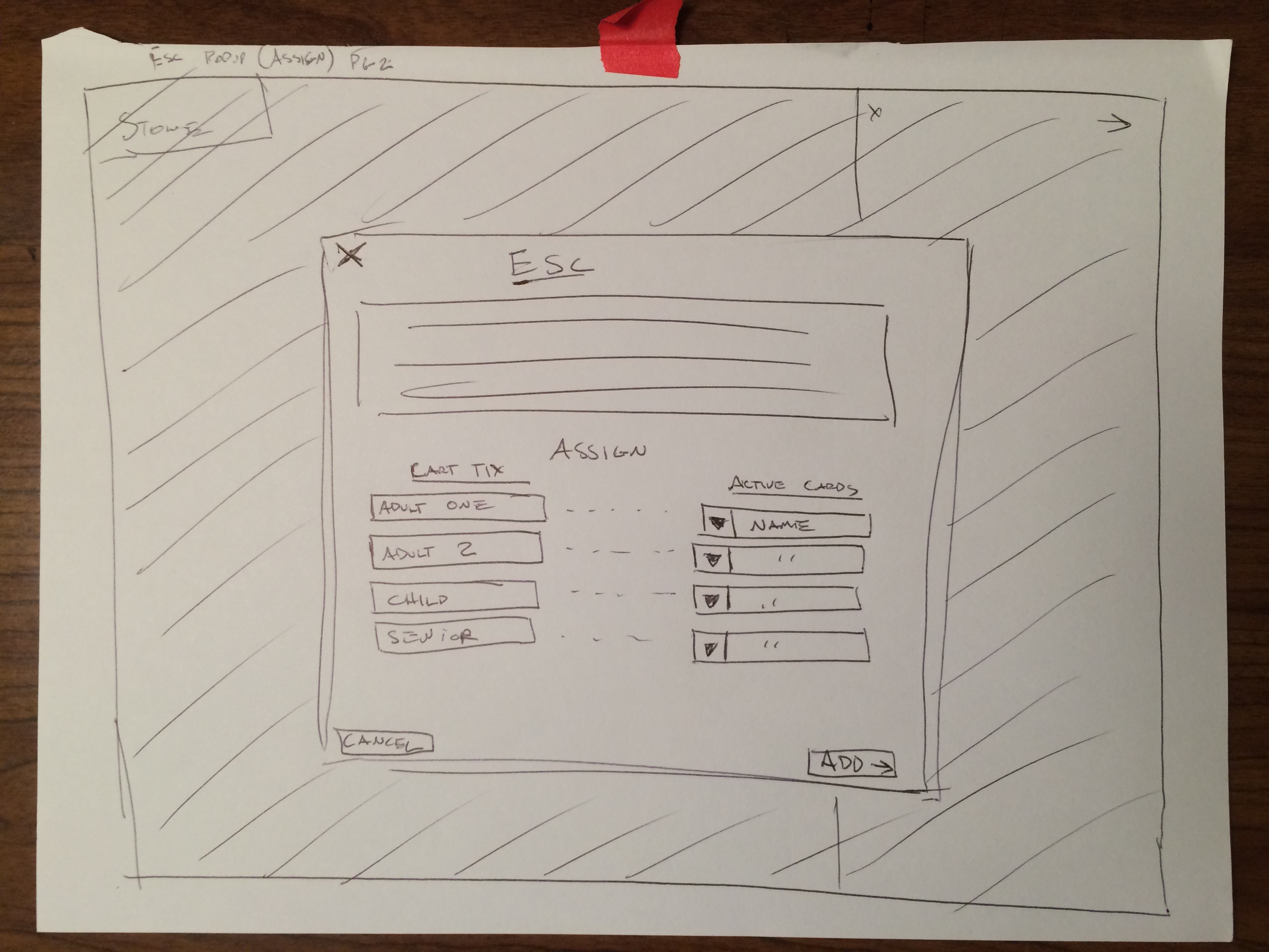
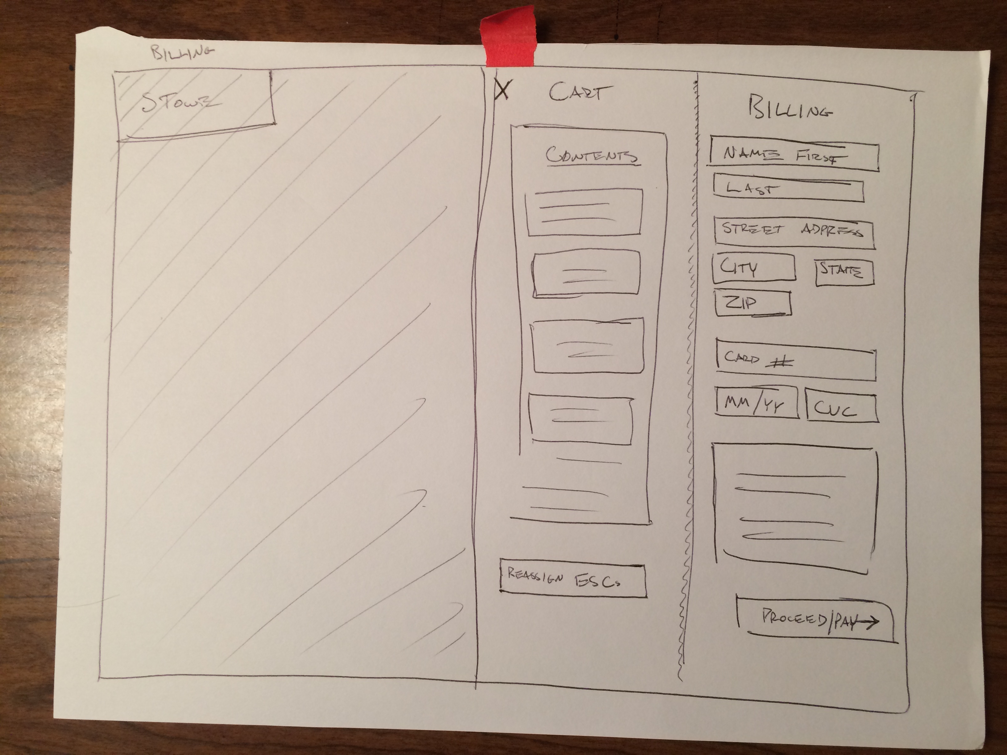
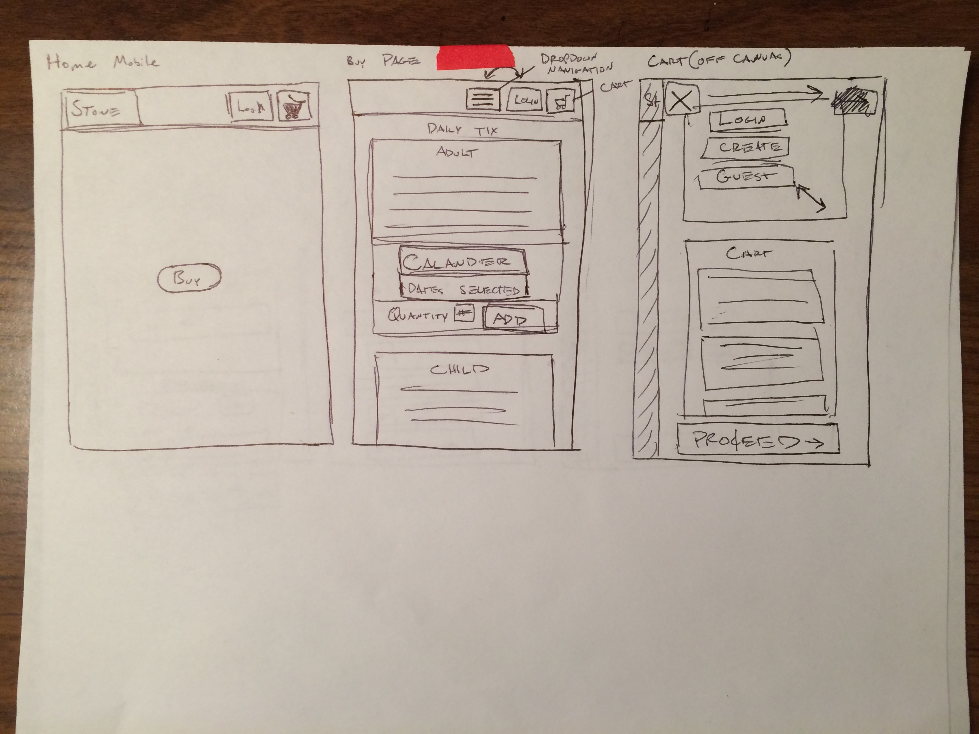
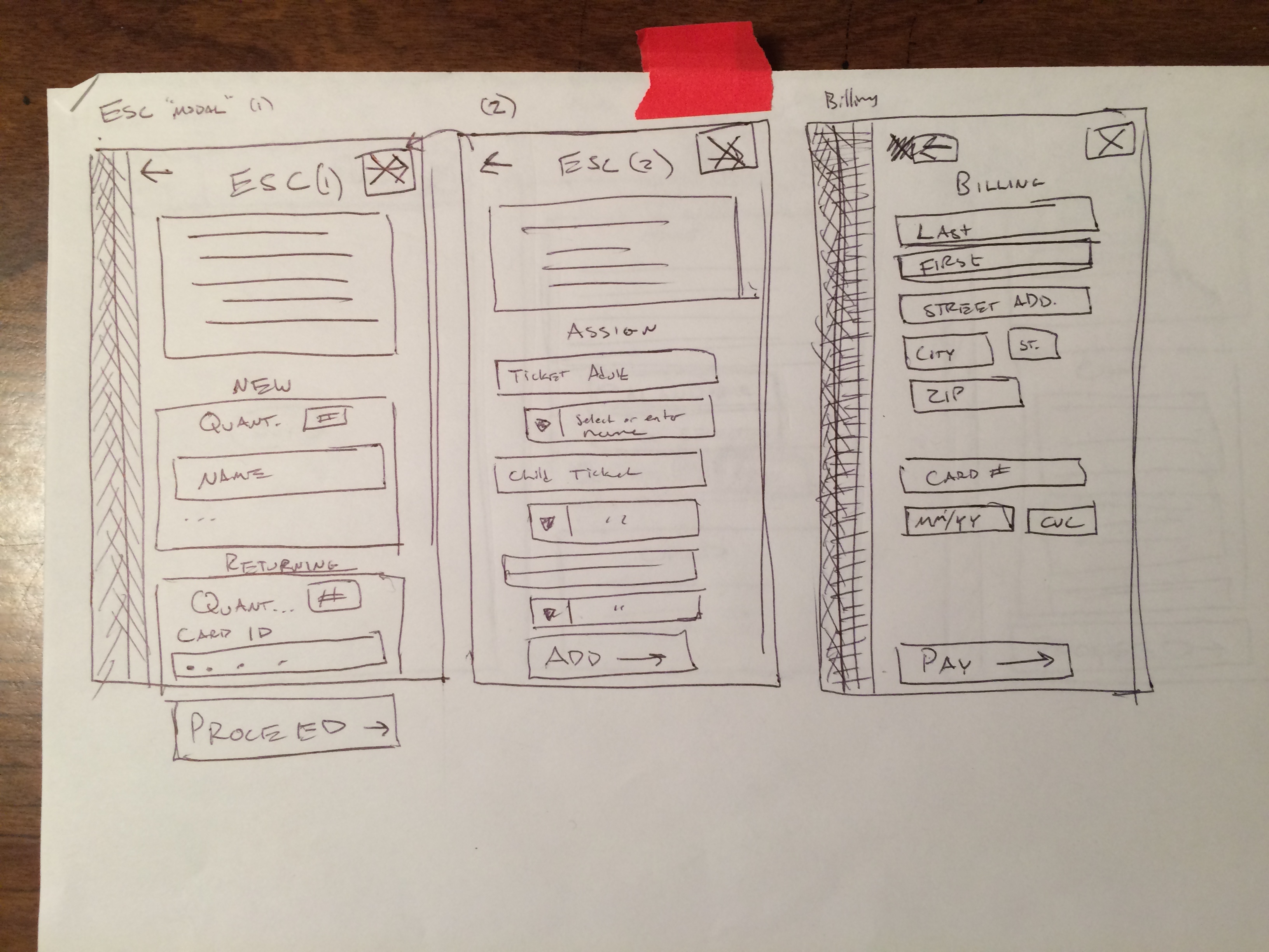
Wireframes are important to organize page elements without the distraction of visual styles. This allowed me to create a decent system before adding in visual elements.
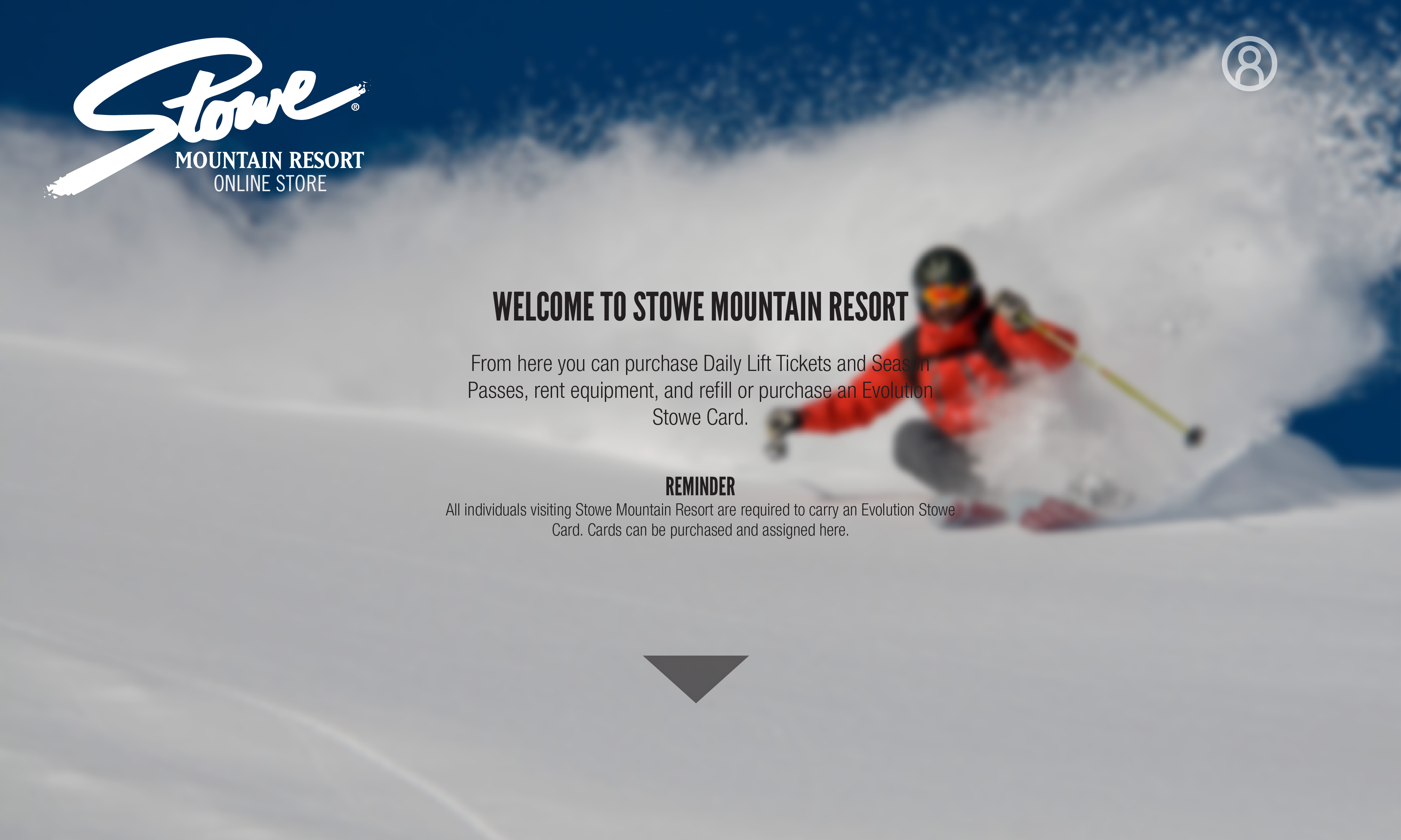
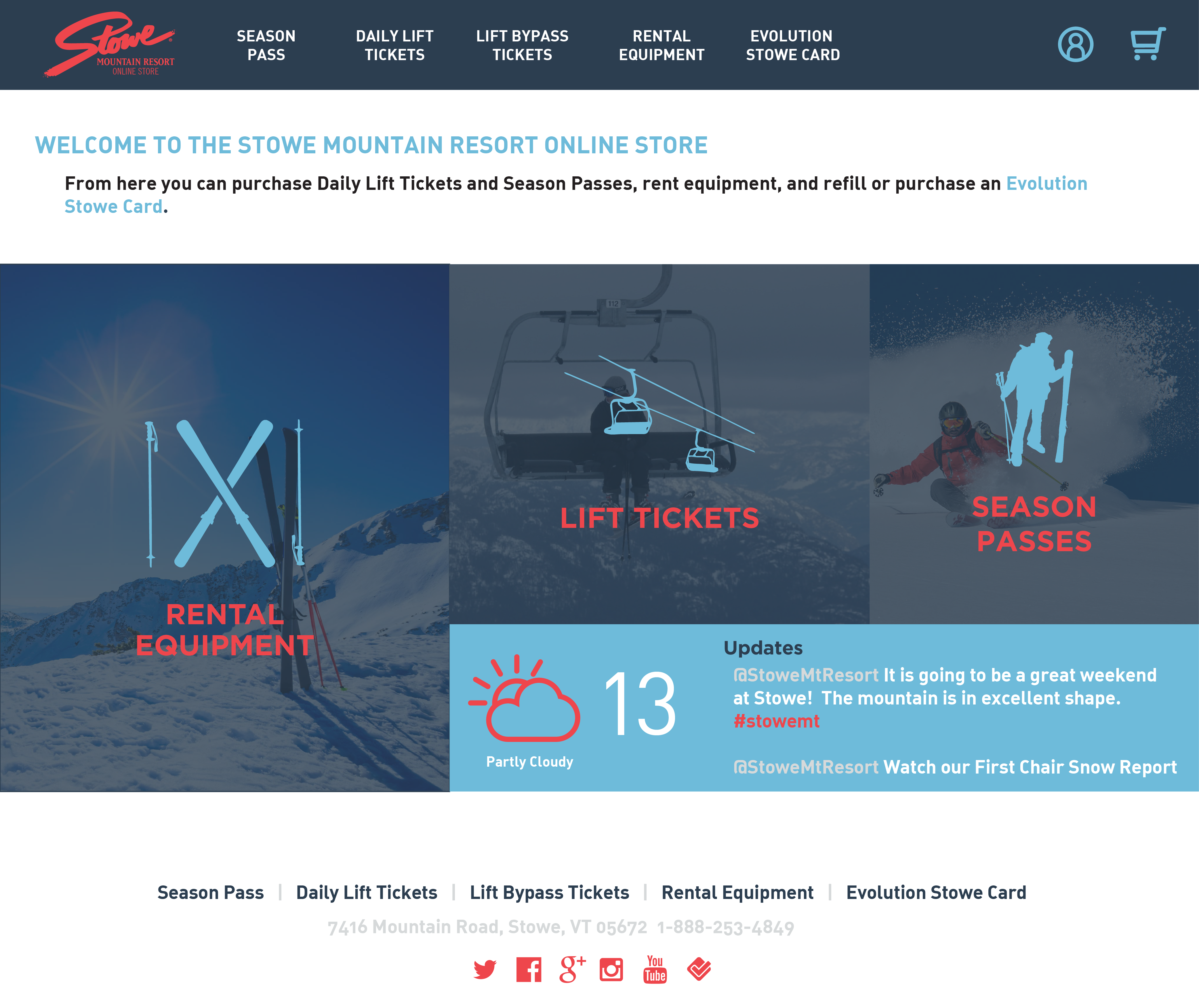
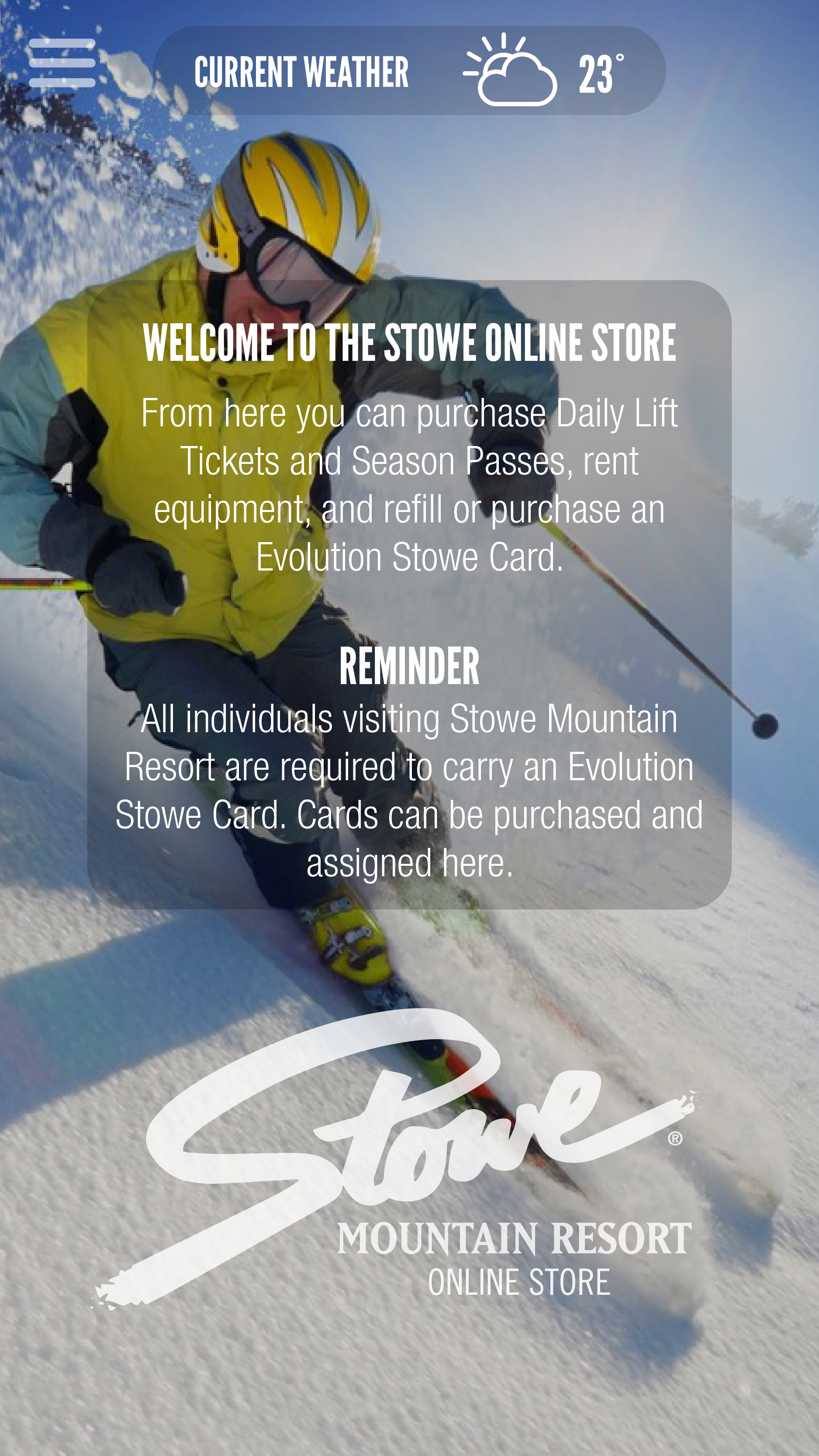
There are two sets of mockups here, one of which ended up turning out better. I wanted to stick to a strict color scheme to give the site unity and also allow visitors to easily recognize elements. For example, nearly all buttons are red.